BLOG
How to Combat Form Abandonment In Online Financial Services
Published: Jun 3, 2016
Forms are crucial to the success of your online finance site. Follow these smart tips and you’ll reduce form abandonment and increase conversions on your financial service site.
Digital transformation has changed everything. From the way brands communicate with customers, to onboarding new leads and advertising their products and services. But for financial institutions, there’s one element of the onboarding process which will never change.
Your visitors need to fill in a form.
For years banking institutions and financial businesses have implemented forms. They’re needed to apply for loans, mortgages and new accounts. And despite the shift to digital channels these forms are still long, complicated affairs most consumers dread filling in.
Digital transformation has done little to change the way financial institutions operate. For many financial brands, it’s still business as usual, the only noticeable difference is in the way their application forms and financial advice is delivered.
And this is a potential problem.
Abandonment is a crippling problem
The digital revolution has turned online shopping into a buyer’s market.
The growing availability and selection of services, coupled with a wealth of information has created a consumer belief products and services can be found for cheaper or through a swifter process elsewhere.
It’s a shift which has changed the way people interact with online businesses.
Customers are quick to abandon their purchases even after completing 90% of their purchase journey. The Baymard Institute puts the percentage of shopping carts that are abandoned at just over 68%.
And the number of people who abandon their forms is equally as shocking.
Whilst there’s no definitive study on form abandonment in the financial sector various case studies corroborate the statistics that around 60% – 70% of users will abandon their form before seeing it through to completion.
For an industry that relies on the completion of forms to onboard leads and assesses their suitability, this presents a huge problem.
Financial institutions have enough to contend with now that tech firms are encroaching on their territory. You can’t afford to overlook the one important area of your business that is paramount in growing your lead database.
You need to optimise the forms your business depends on so that you reduce the abandonment rate and increase the number of leads you’re capturing. The question is, what steps can you take to ensure that more of your leads are completing their forms?
Keep it simple
This is the golden rule for opt-in forms of any format.
You need to keep them as simple as possible.
Even reducing the form fields by one or two fields can help bring a healthy increase in conversions. Neil Patel of Quicksprout.com studied the effect of form fields on conversions and discovered three fields converts at a rate 10% higher than a form with six fields.

The above is of course based on businesses which don’t require as much information as a financial institution. However, the point still stands. The simpler your form, the more people will see it through to completion.
When things become too much like hard work, your prospect will abandon the effort. They’ll move to a competitor who has optimised the prices so it can be completed in a fraction of the time.
You need to examine your forms in detail and ask how you can minimise the form to increase conversions yet still get enough information to accurately segment, advise, and sell to them.
It’s a difficult task, however, with a little creative thinking it’s definitely possible. For example, you could:
- Ask for the basic minimum information (name, email/phone number, a reason for contact) to secure the lead before pursuing further information through an automated email sequence or phone call.
- Establish specific landing pages to help you segment the people who sign up via that page. You could run different automated email sequences for sign-ups from each page to learn more about them over time whilst qualifying them as a good lead
- Offer a gamification element to the application to hold user interest and get them to finish.
The first consideration you should have when creating an opt-in form is whether every field is absolutely necessary. Your goal with an opt-in form is to secure key contact details. If there are fields that aren’t going to help you do that, then get rid of them.
Exit-intent overlays
Sometimes even the most highly optimised forms will still fail.
You’ll see users begin to fill things out only to abandon the form at the last minute for reasons no-one can discern. In these situations, you can either let the lead leave and chalk it up as a loss, or you can make one last-ditch attempt to get them to finish what they started and hand over their valuable contact details.
Exit intent overlays have proved to be successful in all fields of online commerce business. We’ve seen great results implementing them for clients including M&S and Domino’s Pizza garnering such results as a 99:1 ROI. However, when discussing exit intent most marketers immediately think that they’re only useful for traditional retail stores, which simply isn’t true.
Sure, that’s the area where they’ve been most widely used, but there are lots of examples of financial institutions that have implemented them successfully to drive higher sign-ups and conversions.
After introducing exit intent overlays, top UK travel insurer Staysure saw some excellent results. During a 6 week sample period, a third of visitors abandoning the quote process chose to engage with an overlay. One in five of these visitors, who would otherwise have left the site, went on to complete the quote process.

When you’re implementing your exit intent overlay there are a few key considerations that need to be made. You need to ensure:
- You have the timing right. Your exit intent overlay should only display once a user is exhibiting signs of exiting the site.
- The copy in the overlay is compelling or includes a “too good to pass up” offer
- Your overlay leads to a smart automation campaign to get the most out of the details you capture
Embrace your mobile strategy
Mobile devices have become the primary browsing device for online consumers.
The convenience they offer has been embraced by consumers across the globe with 30% of all online transactions now completed on mobile. Unfortunately, mobile is one area where financial institutions are seriously lagging behind the competition.
Very few financial institutions have a comprehensive mobile strategy established. They don’t have a useful app, haven’t optimised a mobile-specific site and don’t facilitate cross-device journeys. With such little focus placed onto mobile devices, it’s no wonder financial forms are often more confusing when viewed on anything but a desktop.
Although they only make up a very small element of your wider optimisation strategy should take the time to fully test different variations of your forms. It’s by no means a comprehensive list, however, the below are a few key considerations you need to make when optimising your forms for mobile devices.
- Enlarge entry fields and clickable elements to allow users to easily select and enter text on the smaller display
- Disable auto correct as it can cause issues with certain words and potentially derail an otherwise smooth experience
- Make certain elements like phone numbers or email addresses clickable to save the consumer time
- Reduce address entry to one field by implementing an address autofill
- Use a number pad for number entry (not the generic keyboard)
More and more users will be using mobile to check out your business and the products you offer. Mobile optimisation is no longer something that’s nice to have, it’s a necessity for the success of modern businesses.
Of course, the problem is that a mobile optimisation strategy is an incredibly involved process. A comprehensive strategy should take everything from customer usage and cross-device habits to basic copy changes and user experience issues into consideration.
If you think your mobile optimisation strategy could do with a little pick me up, be sure to check out our article on cross-device journeys and optimising for the modern user.
Optimise your copy
If we’re being honest, no-one relishes the idea of applying for a loan. If we’re being really honest, most people would like to avoid talking to the bank at all. Conversations and applications with a bank are often long, laborious processes associated with negative feelings. Consumers don’t think of the potential of what they could do if successful with their application and instead choose to worry over the implications if they’re rejected.
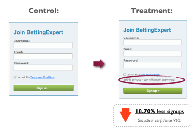
You’ve got to be very tactful in your approach when writing for online audiences. Choose the wrong word in your compelling sales pitch and it could be the difference between exciting or terrifying a customer. It’s something Content Verve put to the test when attempting to increase conversions and form completions.
They discovered that even when using negative words in a positive manner, consumers reacted negatively. In the below form you can see how they included the mention that they will never spam their customers. It’s a pretty apparent benefit to most of us. However, the simple mention of spam lowered overall completion rates by nearly 19%. Content Verve theorises that this could be because the term spam brings negative connotations and thus lowers the image of the brand in the mind of the consumer.
Every piece of copy in your forms needs to be carefully chosen. Finance has the added misfortune of working with the one commodity most users are extremely protective over – money. You can’t afford to make mistakes in any area of your copy.
As a general rule, you should try to ensure that all copy, from form fields to privacy statements and even your primary CTAs are benefit focused. That means making no mention of words with negative connotations like order, purchase, repayments etc but instead focusing on words that the consumer wants to hear such as approved and accepted.
Focus on what they’re going to get and what they can do with it when they do. It’s a simple change intact which can make the world of difference when convincing consumers to take a chance.
Sort your forms out
Look, we know that optimising forms isn’t a sexy aspect to digital marketing. You want to be focusing on the cool things like testing awesome headlines, using killer images and creating kick-ass CTAs.
And that’s all an amazing use of your time. However, you can’t overlook your forms. Your form is the last hurdle to gaining a lead’s contact details. All that hard work you put into optimising the other elements of your site will be worthless if it unravels at the final step.
You’ll have to run various tests on your forms to see exactly what will work best, but as a general start to get you going in the right direction just make sure that your forms hit the below four goals:
- They’re as long as they need to be and no longer
- They’re optimised for mobile devices
- They’re no mention of words with a negative connotation
- You have some form of backup, most likely an exit intent overlay that prompts them to finish what they started
Once you have these four elements in place you should see a healthy rise incompletions and you’ll have the security to then start accurately testing variables to increase your lead capture and form completion even more.