EBOOK
M-commerce Myths
Published: Feb 28, 2019
5 mobile commerce myths debunked
Every year since 2006 has been hailed as the ‘year of mobile’. But in reality mobile, and within that m-commerce, is no longer an upcoming trend, or ‘the next big thing’. M-commerce is well and truly here (in fact, some claim it reached the tipping point way back in 2016!)
So, you may ask, why are we publishing an ebook on m-commerce?
Well the fact you’re here for a start, indicates that things aren’t done with when it comes to m-commerce. Mobile commerce is continuing to evolve at a rapid pace, meaning what we knew yesterday, isn’t necessarily true today. Consider the increase in digital media usage in the below chart from Mary Meeker’s Internet Trend Report:
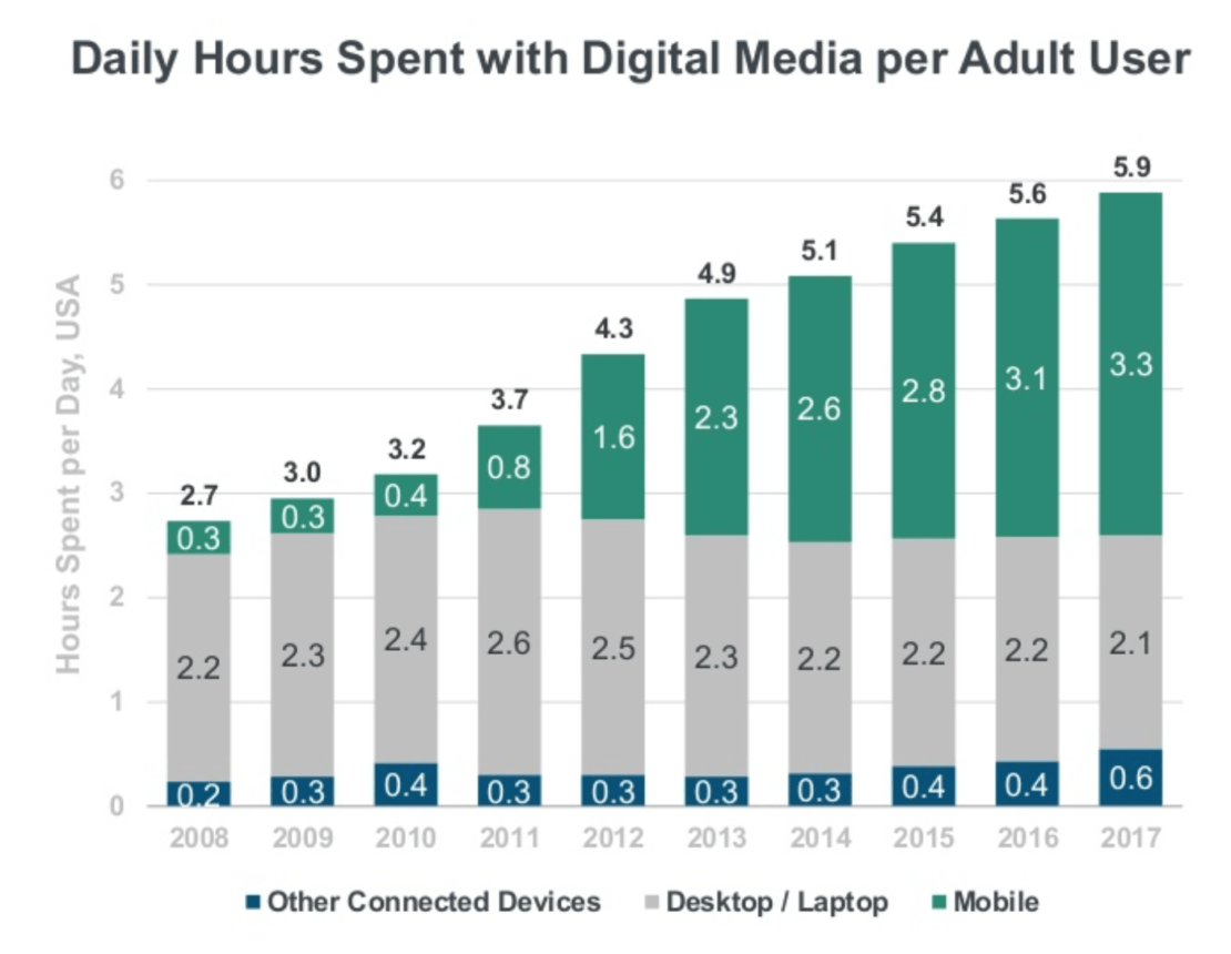
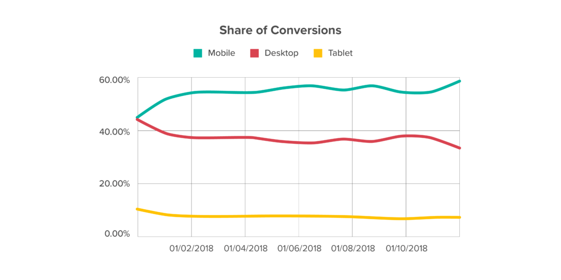
What’s evident is the huge growth mobile is driving when it comes to time spent online. Yet despite this huge growth, there’s been much made of a ‘mobile commerce gap’, with a 2017 comScore study reporting that mobile accounts for 69% of traffic, but only 20% of conversions.
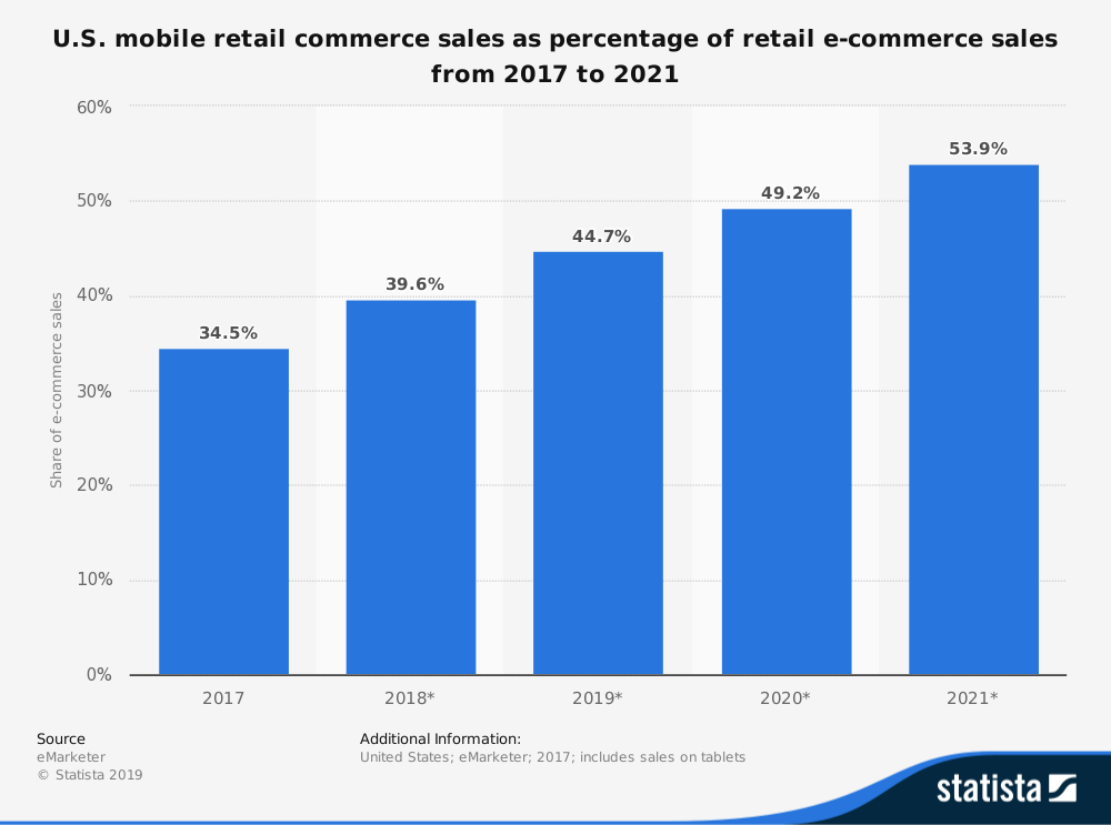
But is this still true today? If we look at the data, we can see that m-commerce in the US, actually seems to hold a pretty healthy share of the pie when it comes to sales. And this is just one of the myths we’ll seek to bust, or confirm, in this report.
The impact of mobile access to e-commerce is wide-reaching, and requires companies to consider every aspect of online shopping, and how they might better serve the growing customer base experiencing their sites through mobile devices.
There are a lot of different factors to think about:
- How visible relevant deals and offers are when presented on a smaller screen
- How to take advantage of social shopping, instigated by traffic from social media.
- How to handle payments when consumers are on-the-go
- The impact of multi-device journeys on customer experience
With so much to consider, it’s easy to see why confusion arises around what m-commerce actually means for e-commerce businesses, and how strategies need to adapt in order to improve the customer journey.
This ebook is here to solve those problems by dissecting some of the myths surrounding the ever-changing world of m-commerce. We’re going to debunk common misconceptions, and show you how to make the most out of mobile!
M-commerce myth #1: Consumers stick to their preferred devices when buying online
It’s easy to think of your m-commerce strategy as a standalone thing. A new strategy to add alongside those you already have in place for more traditional e-commerce. This comes from the idea that a customer who ends up buying a product using their phone is likely to have carried out the entire customer journey through the same screen.
Increasingly, consumers are beginning their online shopping on one device, and completing the purchase on another. We watch one episode of our favourite show on a Smart TV, the next streamed onto our phone, and the one after that on our desktop PC. Our shopping habits often take similar journeys – studies show that up to 65% of all online purchases involve multi-device journeys.
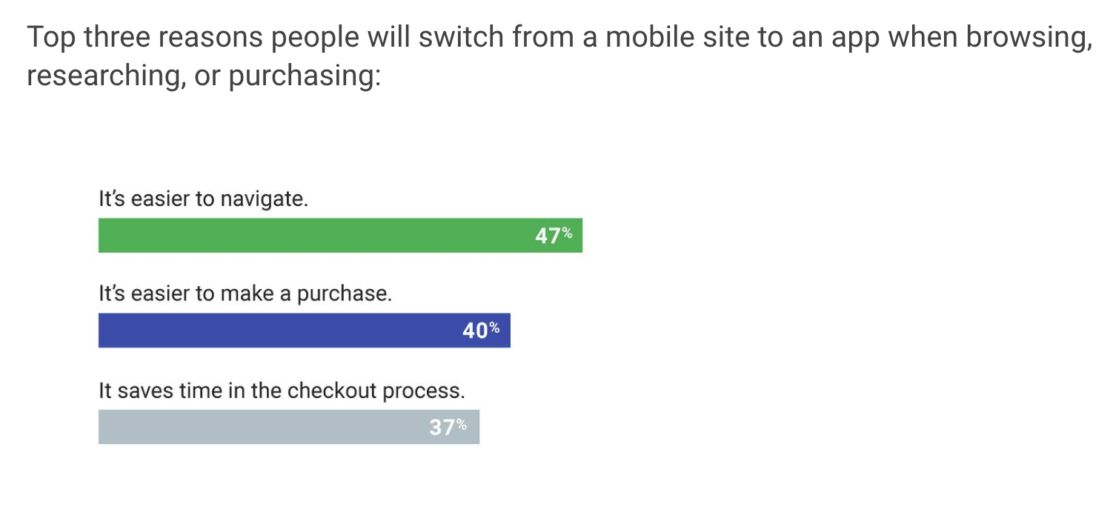
Even within mobile, 46% of users are switching between mobile sites, and mobile apps, and actually this helps in debunking our first myth. The reality is that consumers will go with whatever device, or indeed app, that serves them best in that moment – it’s all about a smooth customer journey.
Consumers might start browsing on a PC, before ultimately completing their purchase through their phone during their commute into work. For purchases that require lengthy consideration (expensive purchases, or those that may involve research to ensure the right deal), it’s even more likely that the consumer will engage across multiple devices during their journey.
Your challenge, then, is to make sure each consumer has a consistent experience with your site, regardless of which channel or device they might be viewing it from. If a potential customer has been looking at jackets on their PC, it’s a good idea to direct them to jackets next time they log into the site on their phone.
A smart way to do this is to map out the customer journey your site offers, and try and identify all the touchpoints along the way that offer you opportunities to connect with your customers browsing on their phones.
Online bathroom specialists soak.com worked with Yieldify to identify these mobile opportunities. As a high-consideration purchase, an important consideration for the customer journey was which devices consumers were likely to be accessing the site through at specific points during the day.
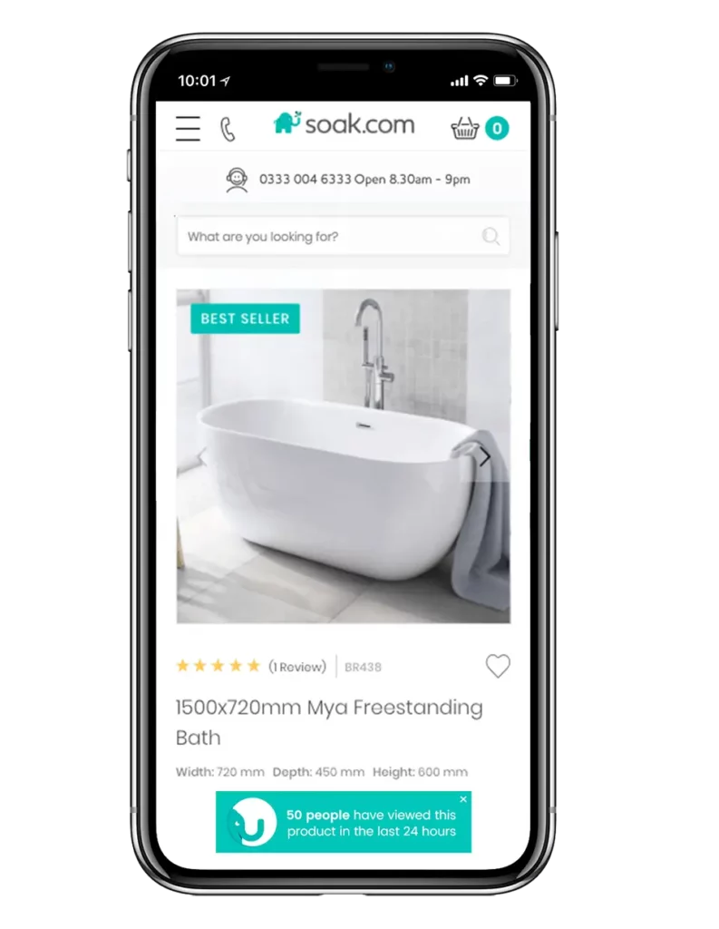
Utilizing Yieldify’s time of day targeting feature the brand was able to test the impact of social proof at different times, across different devices. The results showed that mobile users browsing the website during lunch break hours who were shown Dynamic Social Proof were more likely to convert, with conversion rate among the target group increasing by +11.2%. It also showed the importance of having a customer journey map in place.
This worked because the campaign looked at not just how, but when consumers would be browsing the website. Bathroom fixtures are the sort of product that requires a lot of planning and consideration before purchase – targeting browsers who were using their mobiles to check out products at lunchtime made sense, and this hypothesis was backed up by the data.
What to learn from this myth
For mobile websites, think about how you can help visitors make their decision by adding context, without disrupting the customer journey. Base this on analysis of your customer behaviour, as we saw in the soak.com example.
Delivering messages anchored to a particular page element is a quick way to do this, and takes into account the limitations of screen real-estate on mobile. Then you can easily test different messaging and targeting to understand what works when it comes to influencing your customer journey, without the need for extensive IT set-up.
M-commerce Myth #2: Mobile users don’t convert
We’ll be honest: we can see where this myth has come from (we even referenced it at the start of this guide). It’s certainly true that whilst traffic continues to increase across mobile devices, conversions aren’t keeping pace. But here’s the important thing: mobile conversion rates are increasing, and will only continue to do so as the way we shop develops further.
Already, more than 57% of search traffic online comes from mobile devices. This makes sense when you consider what Google calls the ‘mobile moment‘ mindset. Unlike in the past with desktop where we might have ‘gone online’ to check something, we now live online. Consumers can use their mobile device to search, discover and buy the moment something pops into their head, wherever they are. It’s a huge cultural shift that means we’re in the midst of a major change in consumer behaviour that will impact your m-commerce strategy.
The question
Increasingly we aren’t using these moments to play games or read listicles, but to meet needs we have
Once again, understanding the customer journey is central to your ability to cater to these mobile moments. With mobile responsible for more than half of Google searches, this means optimizing the journey for users arriving from paid search. Google Shopping dominates paid search on mobile, and is becoming increasingly competitive, so getting the journey right is also a case of ensuring return on investment.
A key insight into Google Shopping traffic is that 75% of searches arriving via this source land directly on product pages, despite being broader category searches. There’s no guarantee that the product Google has directed your customer
What to learn from this myth
If you’re sending your search traffic to PDPs, you need to find a way to give consumers the opportunity to discover other relevant items. Notifications that use Dynamic Social Proof to demonstrate what others are buying are one way to
M-commerce Myth #3: Mobile-first indexing means everything needs to change
July 2018 saw the launch of Google’s mobile-first index, which gives preference to websites that are optimized towards mobile access. It’s an important change, and one that’s been coming ever since mobile devices became responsible for over 50% of search queries on the site. It represents a fundamental reversal of how Google is thinking about your website from a ranking and content perspective – the mobile version of your site is now considered the primary version of your site.
But, while there are a few new realities to adjust to when it comes to mobile, it doesn’t mean the death of desktop or throwing out your old mobile strategy completely. In fact, if the desktop and mobile versions of your site are identical, you may have not had to do much to maintain your rankings.
So what do you need to consider if you want to ensure your site continues to perform well in Google’s new mobile reality?
Perhaps the biggest change to date is Google’s mobile page speed update, which now includes page speed as a ranking factor for mobile. It makes sense – people want to be able to find answers to their questions as quickly as possible. This used to only be a consideration on
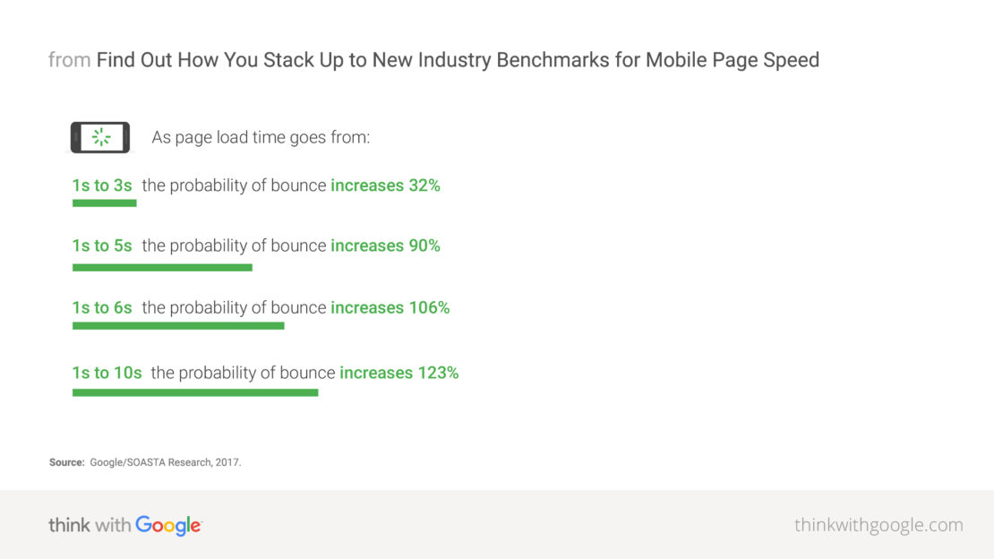
According to Kissmetrics, if an e-commerce site is making $100,000 per day, a 1-second page delay could potentially cost you $2.5 million in lost sales every year. Fortunately, Google has some great resources to help you understand if page speed is an issue on your mobile site. Even if it’s not (lucky you!) mobile bounce rates are typically 10-20% higher than on
What to learn from this myth
The rules are broadly the same as for desktop. Start off by analyzing your customer journey map to understand where you’re losing visitors. A high bounce rate is indicative of entrance pages that aren’t relevant – so ensure you’re mirroring your marketing messages throughout the customer journey.
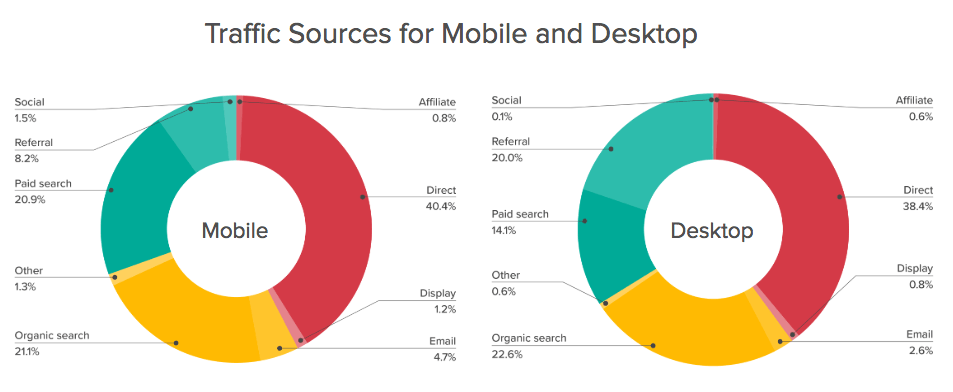
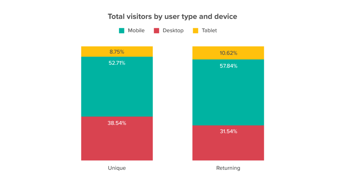
For example, if traffic is arriving from an offer advertised on social media, utilize this fact to re-engage them once they hit the site. This type of personalization is especially important on mobile, where paid search and social traffic represent a higher share of visitors than on desktop:
Recipe subscription service SimplyCook does a great job of reducing abandonment by reminding users why they visited in the first place. In the below example it tailored the campaign by referral source (Facebook – a key channel driving mobile sales),

M-commerce Myth #4: Autocomplete will solve all your payment problems
Oh boy, do we wish this was always correct. Conversion rates remain lower on mobile than desktop, and no small part of this is just how complicated payment systems can appear when you’re navigating them on a six-inch screen.
There are few things more daunting to a mobile shopper than reaching the payment screen and seeing a lot of boxes, each half the width of their index
Then there’s the three-hand task of holding a credit card, holding a mobile device, and typing the long number into a two-inch keyboard. For many, it just seems easier to put off the task until they get to a desktop computer – and that’s the first step to putting off the purchase altogether.
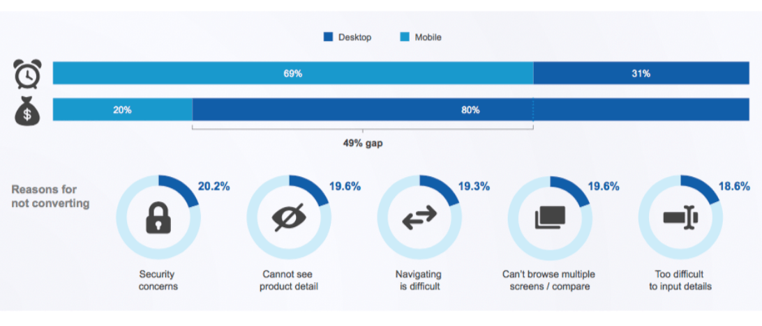
A report by comScore highlighted the five biggest reasons mobile conversion rates remain lower than desktop. Two of the reasons – the difficulty of inputting details and concerns about the website’s security – directly
There are two clear ways to counter these concerns. Firstly, ensuring that the customer feels safe buying from your site. The base level to work from is having an SSL certificate – but there are plenty of other ways to highlight your trustworthiness, including sharing scores from consumer reviews websites like Trustpilot, and using recognizable companies for your payment software.
Making sure your payment process is simple and accessible is the other big element that allows you to win more conversions from your mobile users. In recent years the options available to make your mobile payments as easy as possible have grown exponentially – phones will often offer to autocomplete payments details for consumers, to save them putting the information in manually.
What to learn from this myth
Don’t rely on autocomplete functionality, while this makes the experience smoother it wont alleviate consumer concerns around trust and security.- Consider combining easy payments with trustworthy brands to knock out 40% of those conversion concerns in one go. Iconic payment and digital wallet systems like Paypal, Google Pay and Apple Pay allow consumers to engage in one-click payments that they already know and trust with their money, and can boost mobile cart conversions by 3x according to BigCommerce.
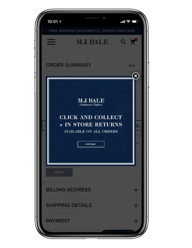
If you don’t have a digital wallet option available, offering reassurance messaging around completion can be another way to combat abandonment, especially on longer forms such as travel booking or insurance applications. Showing a message alongside the relevant form field can aid completion, as Leger Holidays found, driving a +15.7% increase in conversions.
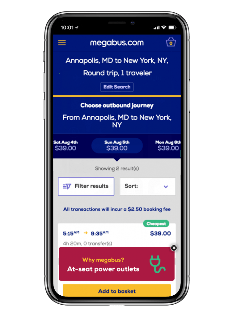
Alternatively, try reducing abandonment with a message triggered on-exit. In the example below menswear
M-commerce Myth #5: Once you’ve built your mobile site, the conversions will roll on in
It would be fantastic if the building of an effective mobile website was the whole story with m-commerce. You build the site, make it fast-loading, user-friendly, integrate it with its desktop equivalent, sit back and watch your conversions spike.
But m-commerce remains a fast-moving and ever-changing game. Central to any ongoing success will be your ability to analyze all the data available to you, while paying special attention to the customer journey map, and adjust your site accordingly. If you can do this, there are plenty of benefits that will allow you to improve conversions further and maintain a website that is always ready to offer the consumer exactly what they need!
A firm understanding of data can drive marketing decisions and improve your ability to provide personalization across your
Making the customer journey your focus is always the best way to ensure you are making the most out of your mobile site. Only once you’ve mapped out what your website experiences might look like from first contact (including the source of that contact) right through to a completed sale, can you fully understand and recognize all the different ways that you can improve what you offer.
What to learn from this myth
In order to continually learn from your efforts to improve the customer journey, you need a testing strategy in place. What works on desktop, won’t necessarily drive results on mobile, so it’s important to separate out your tests by
Bus travel operator Megabus applied this ‘test and learn’ approach to its whole booking funnel, and from this was able to discover how to best boost conversions on both desktop and mobile.
For example, testing USPs at the top of the booking funnel revealed which formats and messages were most successful, and drove a +3.2% increase in conversion on mobile.
Conclusion
As users continue to favour their mobile devices as a means to access the internet and online shopping, the revenue earned from sales on those devices will continue to skyrocket. Now is the time to make sure your website is in the best position to sell to those who are accessing it on mobile devices – whether responsible for all or part of the customer journey.
Consider how the mode of access changes user habits, and target well-placed and relevant campaigns thoughtfully. Make sure your site is optimized for mobile use, so that you can make the most of Google’s mobile-first indexing, and don’t forget to include your payment screens in those considerations!
Nothing will help your conversions more than a system that enables them to happen easily. And finally, continue to look at the data you collect and analyze it to make sure you are consistently offering the best customer journey that you can. Do all of this, and you will have