BLOG
eCommerce Product Detail Page Examples & Best Practices
Published: Jun 18, 2020
A product detail page is the lifeblood of eCommerce. Read our blog post to learn the best ways to create high-converting PDPs and get a free 25-step design template.
Any online consumer will tell you that it’s important to know everything there is to know about a product before purchasing it. And when you are running an eCommerce website, you want everything to be as easy as possible for your customers. Creating high converting eCommerce product pages is an essential part of a successful online store.
But, what exactly is a product detail page, and what makes it effective? All of these questions and more will be answered below.
But, what exactly is an eCommerce product detail page, and what makes it effective?
All of these questions and more will be answered below.
We’re going to cover:
1. PDP Basics
2. Why Product Detail Pages Are Important
3. PDP Best Practices
3.1. General Components
3.2. Conversion Components
3.3. Administrative Components
4. Product Detail Page Examples
5. Yieldify PDP Template
Check the tips and tricks offered in this guide as you start planning your own web-based market strategy to capture leads, interact with customers, and generate profits.
PDP: The basics
What is a product detail page (PDP)? A product detail page, also known as a PDP, is a web page on an eCommerce website that provides information on a specific product. This information includes size, color, price, shipping information, reviews, and other relevant information customers want to know before purchasing.
To put it in more poetic terms, PDPs are the lifeblood of any eCommerce website. To understand them even better, consider Amazon: Notice that when you initially search for a product on Amazon, you’re given a list of products to choose from. When you see one that you like, you click it to find out more information about it.
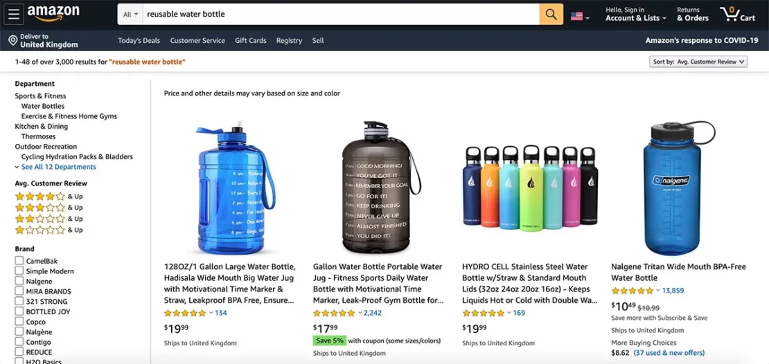
When you click on a product on Amazon, it will open a new page. This page tells you about that specific item in detail, including a description of it, as well as its measurements, materials, ingredients, or installation instructions.
It tells the consumer everything there is to know about the item so they have a better idea of what they’re purchasing. This is the product detail page.
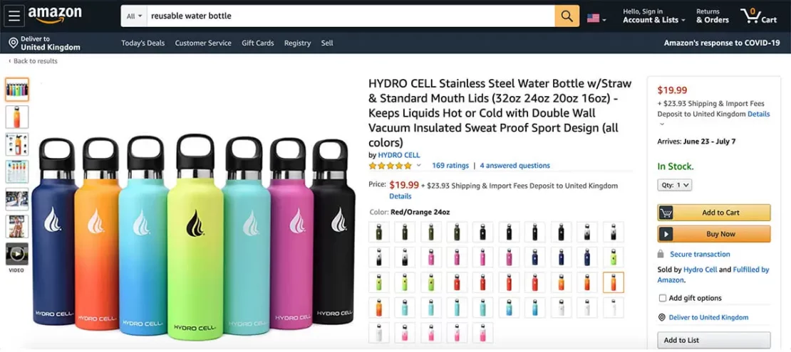
This page usually comes with a series of photos of the item, as well as a list of available sizes or colors it comes in. Last, but definitely not least, there will be an add to cart button somewhere near this product description.
Why is a product detail page so important?
A well-designed product detail page is essential to your marketing strategy since it is the page that leads directly to a sale. It is vital that you give consumers more information about the product they are interested in; otherwise, how are they going to know what size it is or what functions it has?
The lack of an ecommerce product detail page will make consumers more skeptical about your items, and it may turn them off from adding anything to their online shopping carts.
According to Shiprocket, 98% of shoppers discontinue a purchase if the information about the product is incomplete or incorrect. Not to mention that accurate and detailed product descriptions minimize the risk of customer complaints and returns.
Giving customers and potential buyers all the information they need to make an informed decision is the end goal. We’re talking about specific product data, product benefits, key features, social proof, and more which we will detail further below.
Your product detail pages are a key page to start the buying process and generate sales so you need to get the core components right.
eCommerce product page best practices
Now that the importance of having a product page on your website for each and every product you’re selling has been established, it is also important to understand what specifics must go into its design.
You need to design your page in a way that will ensure that your customers will stay on the page long enough to read the product description and make a buying decision. Here are some of the best practices to follow:
General components
There are certain elements that you can’t design a product detail page without. Each and every one of these elements must be present on your page, and the order and placement of these elements on your page can make a huge difference.
These elements will make the overall page design but there are also some specific things that can improve your conversion rate.
1. Menu. The menu is an essential navigation tool for customers to be able to find their way through your site. The menu will offer quick links to different areas of the site, including the homepage, the various product categories, and the customer’s shopping cart.
2. Breadcrumb. A breadcrumb, in web terms, is used to describe the path a person took to arrive at the product page. It will show all of the different web pages that a customer visited before landing on a specific product.
For example, when visiting Amazon.com to look at an air conditioning unit, you may notice at the top of the page that there is a path leading to that product. It may look something like this: “Home > Shopping > Home & Kitchen > Air and Heating > Portable Units.”
3. Product title. This should be the biggest and most easy-to-find text on the page. A product title names the product, showing your customers exactly what they’re looking at. Try to be as specific as possible without being too complicated.
4. Product descriptions. While it doesn’t need to be too long, product descriptions should accurately describe the product and define its features and benefits, its functions and limits. This is where good copywriting comes in handy; knowing what your customers want, and the right language to use to talk to them, can really entice them towards more items in your online store. If you can sprinkle in any relevant keywords from an SEO point of view as well even better.
Product descriptions should also address any big objections or concerns that anyone might have with the product. For example, if you are selling air conditioners, you might want to address a popular concern that customers have with energy consumption by talking about your product’s Energy star rating.
5. Product images. You need good, high-quality images of your product so customers can get a good look at the product. You want them to feel like they are looking at the item in person, so be sure to show images of the product at all angles.
According to eMarketer, digital shoppers expect to see anywhere between 5 and 8 images on each product description site. Don’t forget to add proper credit or copyright to the creator of the image if you are collaborating with others to share product descriptions. Finally, make sure you use high quality images.

6. Price. Probably the most important factor on this page to your prospective customers. The price of your product or service needs to be prominent and clearly displayed. You also have the opportunity to display any discounts or reductions in price here to help drive conversions, i.e use price anchoring that looks like this: $29.99 $39.99.
The price should also be positioned near the “Buy” or “add to cart” button. This is to help with the natural flow of the page and encourage users to go from viewing the price to adding the product to their basket.
7. Call-To-Action. This is the most exciting part of the page. This is where you get to tell your customers to “add to cart”! A call-to-action is a short and quick demand that gets customers to do just that – perform an action. Typically, this action entails adding an item to their shopping cart.
8. Product availability. Potential customers want to know they can get the item quickly, showcasing that the product is in stock, or is limited in stock can help entice them into a buying action and move on to your checkout page. You’ll see most eCommerce sites will show this, so if you can have it on your product detail page definitely include it.
Conversion components
9. Social proof. Social proof can be a game-changer for your conversion rates and is a staple of top tools for CRO. Nothing will convince a prospective customer to buy a product more than hearing the positive feedback from other purchases. Social proof can come in many forms from average star ratings, to industry awards and trust badges. Have a think about what types you can use and leverage social proof if you can.
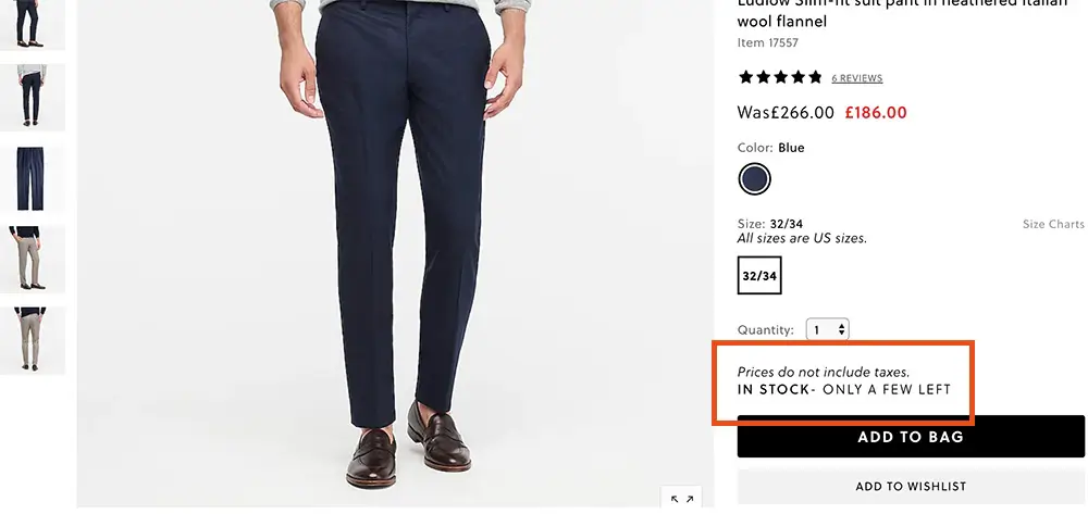
10. Scarcity and urgency signals. Showing that a product is in low stock, or has multiple people viewing it at the same time is a quick and easy way to show a customer may miss out, and they need to act quickly if they want to get the product.
11. Cross-selling. If a user is on a product detail page clearly they are seriously considering purchasing your product. You need to make the most of this intent with clever cross-selling, or upselling strategies.
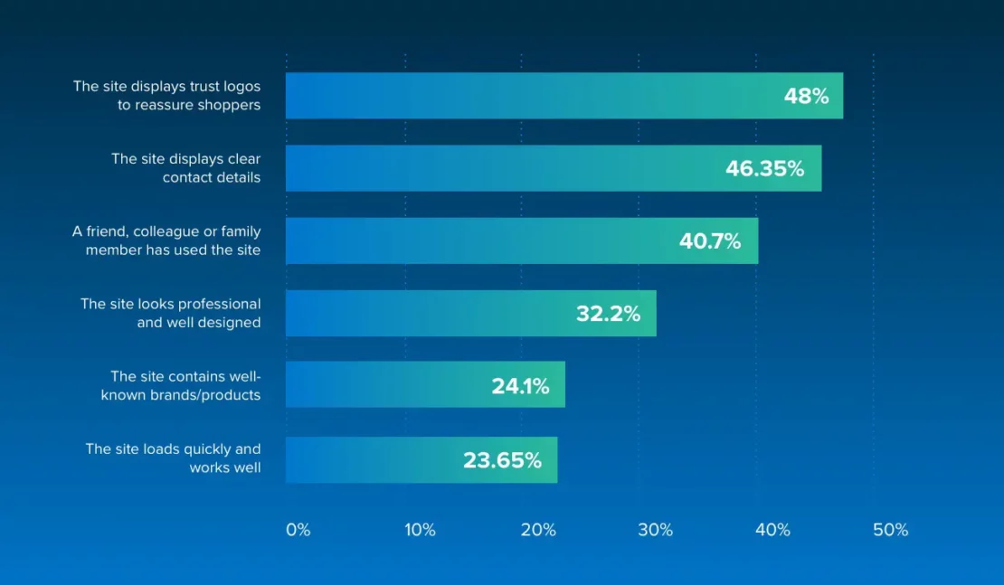
12. Trust badges and trust seals. Trust badges are another quick and easy way to diminish any reluctance to purchase from your website. By highlighting that your website is secure users will feel a lot more comfortable in purchasing from you.
In a survey conducted by Econsultancy, 48% of respondents said that trust badges reassure them that the site is secure and trustworthy.
Administrative components
13. Policies. You may also wish to add certain disclaimers and policies to each product page. This clearly highlights the extent of your company’s liability with the use of your products, and what return policies may or may not exist. A return policy allows customers to feel more comfortable buying from you, just in case they ever need to return it in the future.
Privacy policy and terms of use disclaimer may be helpful as well. This prevents you from getting into any legal trouble in case a product is shipped wrong or has a faulty function. Also, list all warranties and guarantees!
14. Shipping information. You can’t have as much control over shipping as you can over the general price of your products. The same goes for state sales tax. Shipping details will need to be calculated individually with the customer depending on where they live and what kind of postal service they want to use.
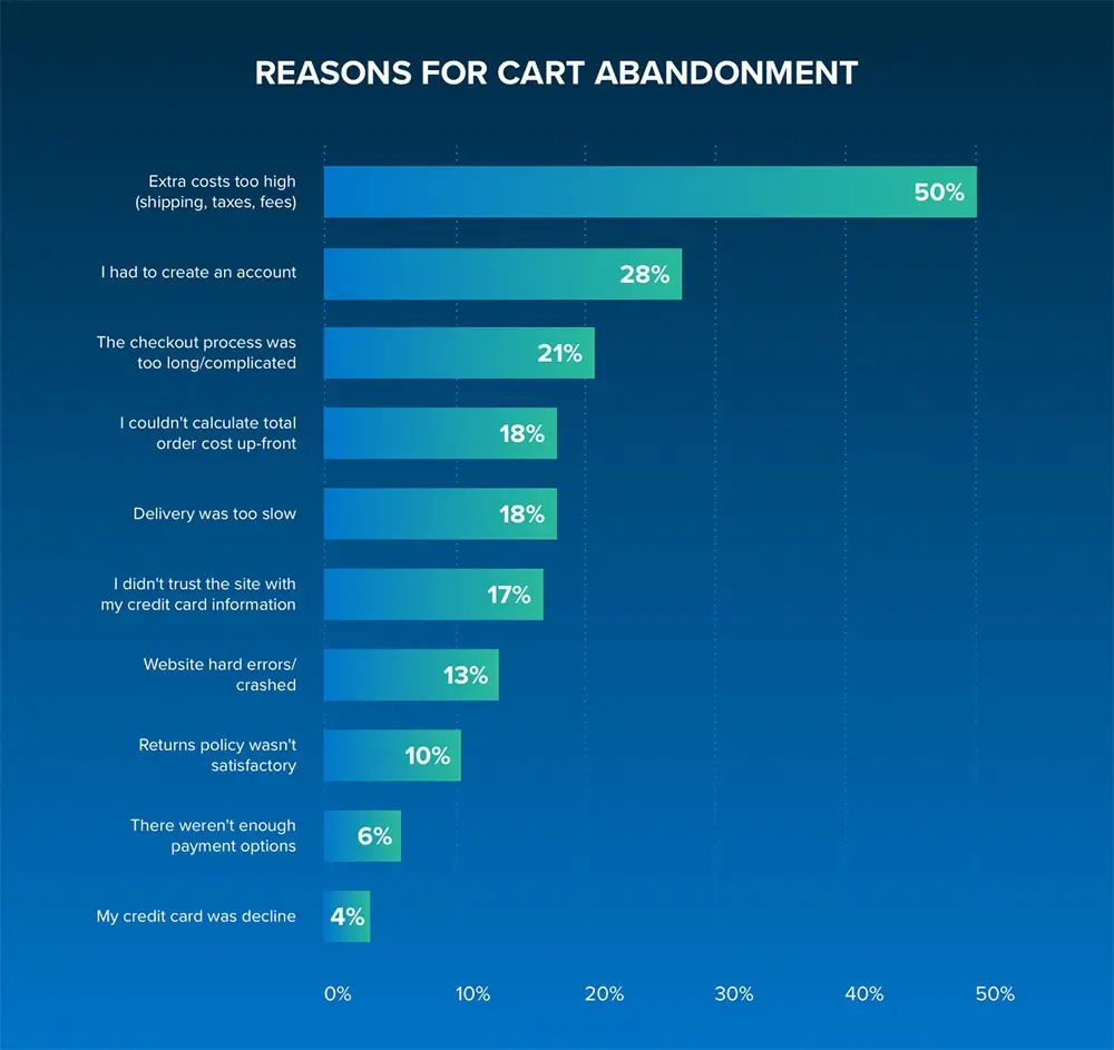
The cost of delivery has a major influence over purchasing decisions. Of those who abandon their basket due to delivery, more than 50% do so because of unexpected shipping costs. So it’s best to address this as soon as users land on the page and to be straightforward about any additional fees that may occur.
3 examples of eCommerce product pages (PDPs) in action
Getting a first-hand look at some winning product detail page designs can help you plan for your own product pages. You’ll see you can get quite creative with your product page layout
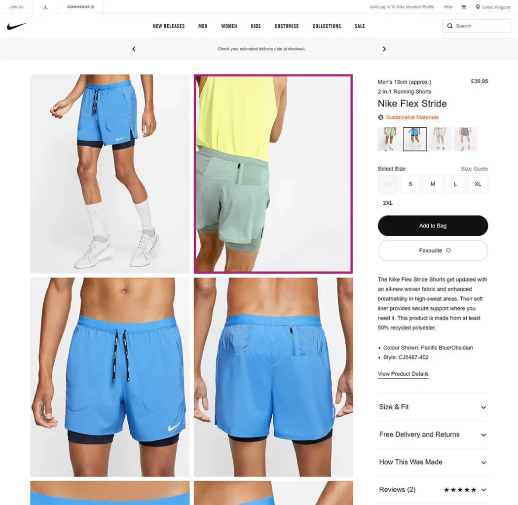
NIKE
Nike is one of the most recognizable brands in the world so you can expect its products page to be on point. And Nike doesn’t disappoint.
The highlighted box is actually a video that automatically plays showing the product in action. All features and benefits can be seen on the right-hand side with special attention shown to the sustainability of the product, even giving details on how the product was made. Reviews can also be seen and delivery information is clearly shown removing any potential barriers to purchase.
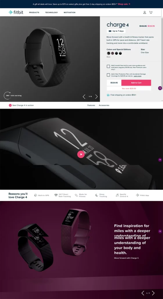
FitBit
Fitbit has quickly become a household name in the fitness industry, and its product pages showcase best practices perfectly. From awesome product imagery and eCommerce videos to a bright and bold CTA, this is a leading example of what a product page should look like. Free shipping is also highlighted, with this section scrolling through warranties and money-back guarantees.
Fitbit also does everything it can to remove any buyer hesitancy by clearly displaying features and benefits. Each section on the menu above is clickable and will display all the information a prospective buyer could ever ask for.
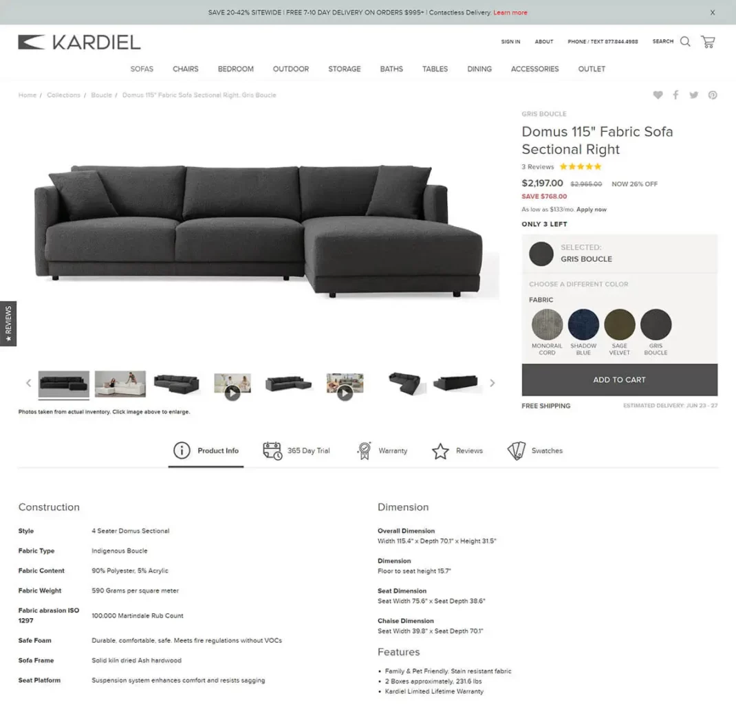
Kardiel
Kardiel is another example of a product page done right. All information is clearly displayed and easy to find. You’ve got multiple high-quality product images, and two product videos, and if that wasn’t enough Kardial also allows users to order “swatches” of the possible colors you can choose from. As this is quite an expensive product to buy online, especially without seeing the product this is a great way to overcome any buyer resistance.
Love Hair
Love Hair’s products are designed to make your hair healthy and beautiful, with a matching clean design for their product detail pages. They use white backgrounds that allow the colors of each individual product to stand out. They have a very easy-to-follow product page layout so you can find all the product details you need.
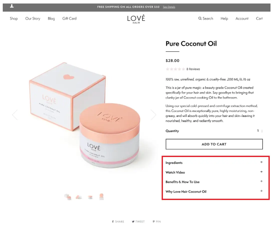
Love Hair has a specific section (highlighted in red above) that provides all the product information potential customers would need. You’ll notice a specific ingredients section, this is something that is likely very important to their target audience so a section that lays out the natural ingredients will work well for them.
Their product details page ticks all the boxes and is a good example. A high quality product image that’s used to draw attention. Reviews from other customers, product attributes clearly displayed. The page is also well optimized for search engines with relevant keywords throughout the content.
Yieldify’s perfect product detail page design template
The below template can be used as an inspiration to create the perfect eCommerce product page. It contains everything the user will need to know to reduce any barriers to purchase. From social proof to highlighting shipping options all the information is present.
View the interactive product detail page design template here or download a free high-resolution PNG version.
Product Page FAQs
A product detail page, also known as a PDP, is a web page on an eCommerce website that provides information on a specific product.
A Product Detail Page (PDP) contains information for a specific & single product. A Product Listing Page (PLP) simply lists all products within a certain category or products that have been filtered.
A great product page will contain all the information a user is looking for, displayed in an engaging and easy to understand way. Check out our template below for more ideas.