BLOG
Smart E-commerce UX and UI
Published: Aug 20, 2019
What does smart e-commerce UX and UI look like in 2019? Find out this guest post from Jake Rheude, Director of Marketing for Red Stag Fulfillment.
When it comes to user experience (UX) and user interface (UI) design, there are different opinions and expectations for all online businesses. But what’s the case with e-commerce sites? What are users expecting from your e-commerce UX and UI in 2019? What should you keep in mind when creating or redesigning your site?
Those are some big questions with a wide range of possible answers based on your industry, customers, specific products, and personal preference. You may enjoy a hamburger menu or loathe them because they hide too much navigation behind a click. Some of us enjoy high-contrast backgrounds, but those could clash with your latest collections’s colors and patterns.
So, diving deep into the user experience (UX) and the user interface (UI) for Ecommerce is going to get tricky. In this blog post we’ll show you some of the most important trends and aspects of e-commerce UX and UI for 2019 so that you can get it right on a big-picture level, and not have to worry about avoiding your favorite colors.
To start with, let’s look at how everything is connected.
E-commerce UX and UI: A Holistic Experience
When we start thinking about the user experience, it’s usually related to our jobs. Designers will think of how the user navigates a site and uses its elements. Marketers often think of the journey people take to make it to a page. Sales will focus on how the user can walk through the buyer’s journey to complete a purchase.
All of these things and more are encompassed in the UX. For e-commerce companies, it’s even more important to remember because the entire experience is wrapped up in your store. E-commerce owners and storefronts should realize that the user’s experience with your brand starts when they first discover you (social, search, and ads are your biggies here), and follows them through to checkout and any post-purchase follow-up..
That automated email you send out thanking someone for a purchase and providing their order tracking is part of e-commerce UX. Going the extra step to make this reinforce your brand by using the same tone of voice, as well as colors and images will have a positive impact on how they remember you.
Put yourself in the shoes of a new customer. Track every step they take to find you and buy from you, then get their product from you and decide to keep it or send it back. Every interaction point along the customer journey is part of the e-commerce UX you’re building. Anything the customer doesn’t like or can find confusing is something to change.
Specific E-commerce UX and UI Elements to Consider
When taking a holistic approach , we must look at a few specific elements that are designed to keep your audience happy no matter where they are in the journey. Your e-commerce UX and UI can’t get in the way, so there needs to be continuity and future proofing when possible. We’ve identified a few elements that can help your audience find you and buy from you.
Voice (and every other) search support
The world is built on search. Unless you’re only selling a single product, it’s likely that your e-commerce world is built on search too. Love it or hate it, customers are going to have to look for you to find you in many cases, and you’ll often get as many people searching your name due to an ad campaign as those just clicking on the ad.
So, search can either be a boon for your business or, if you don’t take time to give search its due, a major pain. Let’s keep you in the positive by looking at a few core elements that your website needs to support in order to capture as much of the search space as possible.
- Voice: This is the latest search trend to take off thanks to virtual assistants. People will speak to their phone in order to find you and that means your website should be built around the way people speak. Addressing questions how a customer asks them or building landing pages around how people talk about your company is a major benefit. Direct search support also gets a little easier thanks to tools like the Google Cloud Speech-to-Text API.
- Pictures: Image search is growing somewhat in popularity and is a smart play if you’re on platforms like Instagram. When you’ve got very visual tools and products, or if you’re trying to stand out, searching by images can help you make the biggest impression. Visual search is also great for getting in on people who will window-shop or want a specific look. Google has a custom search API that can help with a variety of structured and unstructured data searching on your site. What we like best about it for images is that it has dominant color support, allowing search to return images of a specific dominant color. Combine that with our next element and you turn your catalog into something easily searchable.
- Filters: As online stores grow, it becomes harder to find the needle in the haystack. Filters are an amazing way to help customer do just that, especially if they’re not 100% sure of what they want. Filters can help them see what’s in their price range, style choice, popularity, and much more — plus you can build custom tags around styles or anything else you want to add another unique and personal-feeling filter. It is an amazing tool to pair with visual search to let people look for items that fit together. This is incredibly popular with apparel as someone who found the perfect top can match it to a specific color hat or bottom to complete a look.
- Auto-complete: I might know your brand, but it’s unlikely that I know the exact name of your products. However, I might have a general idea about it. Auto-complete features, or selection proposals, help me out by giving me an auto-populated list of items that I might want. It’ll get me to the product faster and you can include images in these pre-populated results to help convince me to click.
These four aspects of search are all about the e-commerce UX. You make it easier by supporting what the customer wants to do.
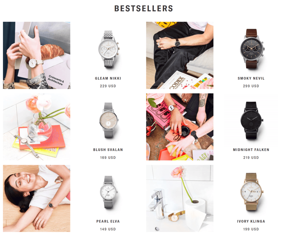
Triwa Watches nails it with a homepage that easily gets to an engaging best-sellers list we found via photo search
The UI side of things is how to make these elements visually appealing and interesting without getting in the way. Icons8 has a phenomenal look at minimalism in 2019 that can be directly applied to your search and site efforts.
Keeping on-site information accurate
Site content accuracy is key for e-commerce – your website must be accurate or you risk losing out on sales and frustrating customers.
According to a 2018 study, when a U.S. consumer online encounters an out-of-stock product:
- 15% go buy something from another store
- 60% buy a substitute for the same store (a little more than half here will stick with same brand)
- 10% go to a physical retail store to find the product
- 15% cancel or delay their purchase
Your website architecture needs help to support the various elements you have to keep track of for your store and warehouse. There are a variety of eCommerce tools that will help, whether they’re small warehouse management systems or whole platforms like Shopify. If you outsource your fulfillment to a 3PL, ensure they have the platform support you need.
Review your process entirely and see exactly what the customer would need and where they might encounter errors. So, find a way to track and show your current stock, shipping options and dates, costs like taxes, and any other element that could affect if an order is placed and filled promptly.
Showcase this in every way you possibly can so customers don’t get any surprises.. If your site supports chatbots, they can be a perfect place to offer customers the most relevant information such as shipping as well as size charts and color options.
Minimize the fluff, emphasize the important
Get rid of the extra elements that aren’t needed, like hiding out-of-stock products or pushing out-of-season items away. Prioritize what customers need and what they use — things like size charts, color options, and customer reviews — on every page that you can.
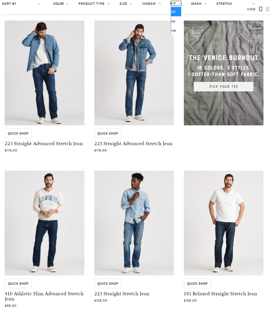
You’ll scratch your head too if you don’t already know what a “121” fit is
If there’s a piece of information that could cause a return if incorrect, such as clothing size, then you must make that as easy as possible to find. It’ll limit those unexpected return and replacement costs.
Give popular elements a place of prominence, both products and content like images, to keep shoppers engaged and moving across your site. If you have stellar photos on each page, then someone will have options to keep shopping if they land on a page with a product they decide against.
Embrace visuals too, because they help tell your story and boost your sales. For instance, one study found that Pinterest users were 79% more likely to buy a product they saw pinned. Other studies looking at a general online audience have found that 96% of consumers say online videos are helpful to purchase decisions and 73% are more likely to specifically buy a product with an explainer video.
After you help them click, take this focus on what’s important to the checkout process. Take considerable time to review your shopping cart and all the steps required to use it, troubleshoot it, and complete the purchase.
The checkout can’t break the experience.
So, keep it quick, easy, and simple. Don’t ask for more information or account details than you need. This will help you protect your business by engendering trust — some users abandon carts when they no longer trust a site that feels too greedy. Simple and intuitive navigation extends to your entire process, including checkout. If you’re using a recurring payment or subscription, this becomes more important because you’re protecting a long-term investment with each customer.
So, cut out anything that’s not needed in order to get people to complete that sale and accomplish your goals!
Personalize when Possible
Let’s wrap up with an element that depends on your budget and software: website personalization. You want to build something for each individual in order to help them, based on how they navigate your site. There are plenty of small elements you can use based on what other people have done, or you can go the full route of creating custom content for people based on their user accounts.
Personalize where you can, even if it’s just product recommendations based on current browsing or highlighting your most-bought products. The good news is that this is affordable, the great news is that it boosts sales!
One final note for UI about concerns in personalization is that you sometimes have to go broad to be personal. What we’re thinking about here specifically is the ability to operate the same way across multiple devices. Building for device-independence is tricky, but the payoff can be substantial. When someone gets what they need on their phone after clicking on an Instagram post and buys, then comes back via desktop for support or to track an order, they want things to look and feel the same.
More people are browsing on smartphones than ever before and building for that screen size while not for a specific platform is essential. There’s an accessibility element in this design too that ensures all of your customers can use your site.
In terms of UI design, this means:
- Support tools that allow your site to be read aloud
- Add captions
- Simplify navigation
- Make visual cues large and distinct
- Use color combinations that are easy for everyone to read or see
- Present the same content in multiple ways
If you need further support here, check out the W3C’s page on accessibility, especially its evaluation support.
Accessibility is a wonderful place to end because it leaves us with the right frame of mind. Your e-commerce UX and UI feel like commercial elements but they’re really about speaking to your audience. Connect with them how they need it and make their work (buying) as easy to complete as possible.
When you design with these e-commerce UX and UI elements in mind, it’ll be a significant boost for your site and your sales.
Jake Rheude is the Director of Marketing for Red Stag Fulfillment, an e-commerce fulfillment warehouse that was born out of e-commerce. He has years of experience in e-commerce and business development. In his free time, Jake enjoys reading about business and sharing his own experience with others.