BLOG
How to Create Squeeze Pages That Convert with 5 Real-World Examples
Published: Jan 26, 2021
If growing your email database is top of the agenda for 2021, you need to start utilizing squeeze pages.
These particular type of landing pages are a great way to quickly build your email list in conjunction with other list growth solutions
If you’re completely new to squeeze pages, then this guide is perfect for you! We detail everything you there is to know about squeeze pages and look at some of the best examples from leading eCommerce brands, including PlayStation, Karen Millen, Subway, and others.
We will cover:
1. What is a squeeze page
– Squeeze page vs. landing page
– Squeeze page benefits
2. Real-world examples of eCommerce squeeze pages
3. Squeeze page design best practices
4. Best squeeze page builders
What is a squeeze page?
A squeeze page is a type of webpage that is used solely to collect contact data from website visitors. The page “squeezes” information, such as email address or phone number, by offering a single conversion action.
In order to persuade visitors to share their personal data, squeeze pages often feature some type of incentive: A special offer, discount, access to exclusive content or community.
Squeeze page vs landing page: What’s the difference?
In a nutshell, a squeeze page is a stripped-down version of a landing page. But it also serves a slightly different purpose:
- A landing page is created to inform and can feature several conversion actions, eg: email opt-in, content download, product purchase, etc.
- A squeeze page is created solely to generate email or SMS opt-ins.
Now, that doesn’t mean that a squeeze page equals a signup form. These pages still feature the typical elements of a landing page, such as heading, value proposition, social proof, etc.
What squeeze pages don’t usually offer is deeper navigation into the rest of the website. In other words, when you land on a squeeze page you have only two options: To convert or to exit. On a typical landing page, you’re allowed and even encouraged to navigate to other pages, including the website’s homepage.
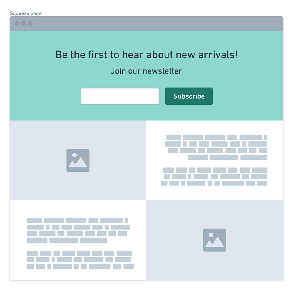
Here’s a typical landing page layout:
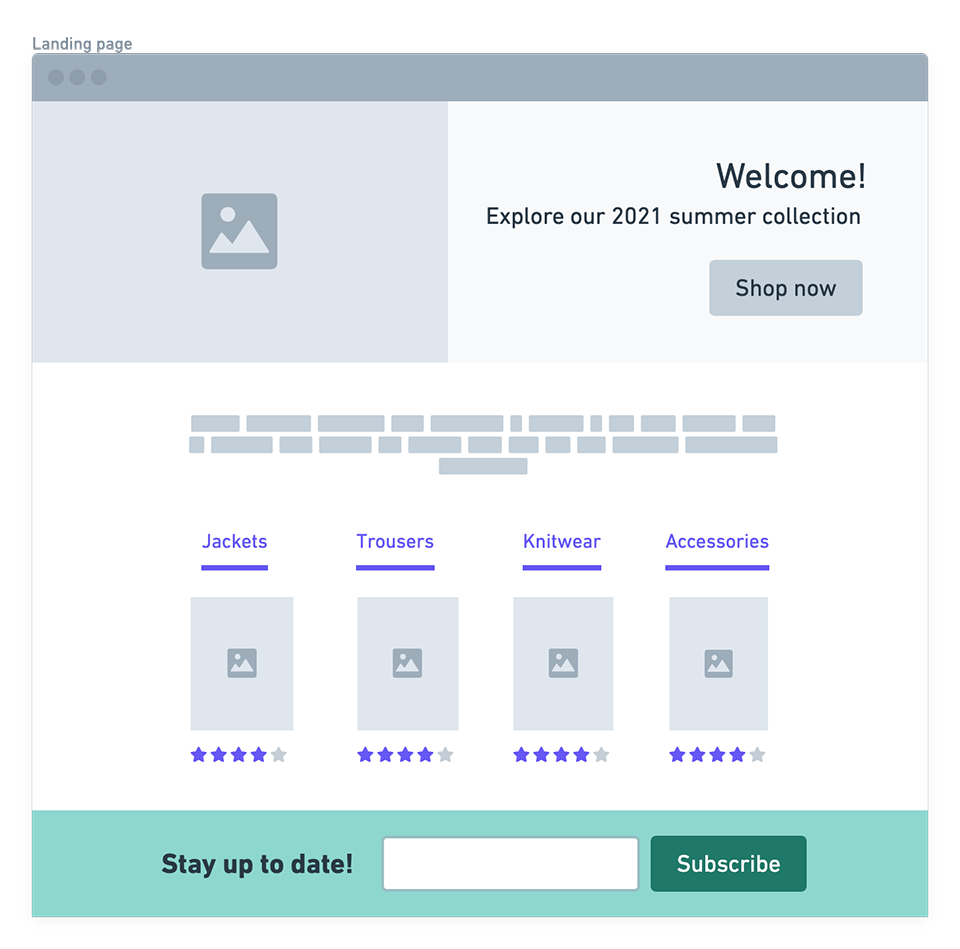
Compare it to a typical squeeze page design: The latter contains a single call-to-action, does not offer deeper navigation, and puts all the focus on getting that email opt-in.
Do squeeze pages really work?
You may be wondering: But why wouldn’t I want to restrict visitors from navigating to other parts of my website?
The simple answer is that by eliminating distractions, such as links to other pages, you force the visitor to focus on the message and offer that’s in front of them right now.
As a business, of course, you need to make a conscious decision when to use squeeze pages and when are you better off with a typical landing page. The usage really depends on your campaign goals.
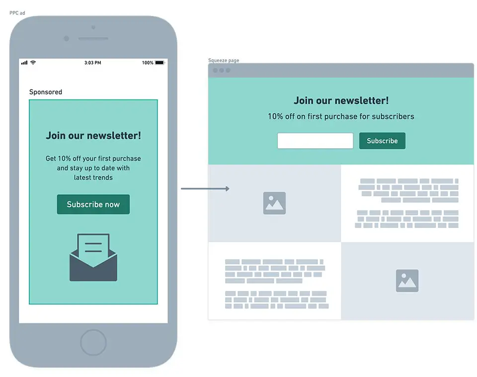
One such example could be a fashion brand that’s running a PPC campaign to draw attention to its newly launched newsletter. A typical landing page can feature the opt-in form, but it will also have lots of other distractions. So you’ll be better off optimizing the post-click experience to include a single conversion action: Get people subscribed to your newsletter.
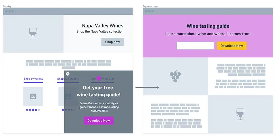
Another scenario would be a wine merchant offering a free wine tasting guide as a download on their website. The download can surely be initiated via a single signup form or an email capture overlay, but chances are you need a bit more space to explain the value of downloading this free guide.
A squeeze page here serves the purpose of providing more details about the guide, and also effectively squeezing the desired information, i.e. email address, from the visitor.
5 real-world examples of eCommerce squeeze pages
Now that we’ve covered some theoretical scenarios for when squeeze pages can benefit eCommerce, let’s take a look at real-world examples. The below come from a variety of eCommerce brands: From beauty to fashion to electronics.
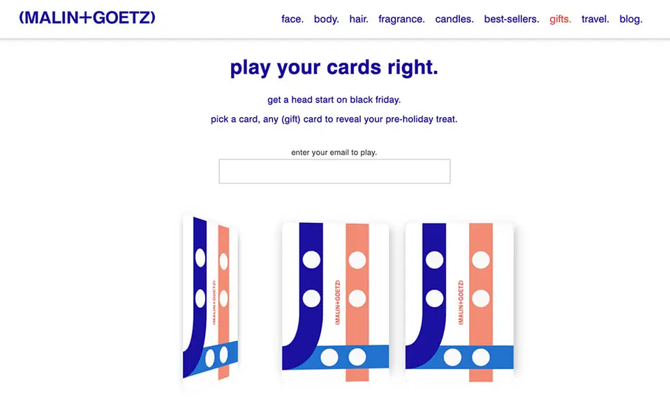
Malin+Goetz
As part of its Black Friday marketing strategy, beauty brand Malin+Goetz ran a giveaway campaign enticing people to “play their cards right,” or, in other words, unlock prizes by joining the brand’s mailing list. The prizes ranged from £5 off your next order to miniature samples.
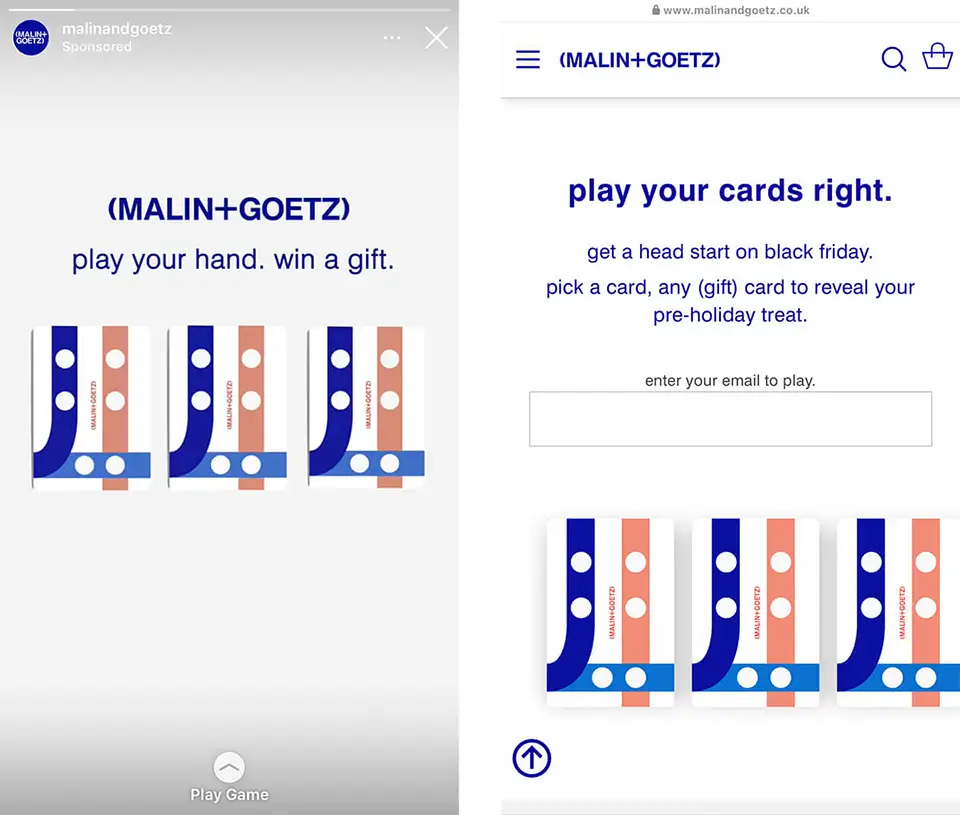
The campaign was effectively promoted via multiple channels, from social media to email. It featured a responsive squeeze page that rendered well and was easy to use both on desktop and mobile.
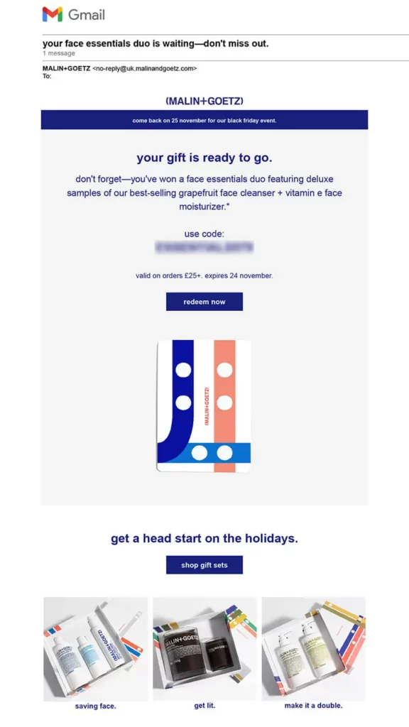
Once the visitor has chosen their card and unlocked their prize, Malin+Goetz also sent a reminder email containing a unique code to redeem the prize. The email naturally includes a nudge to start shopping for the holidays with links to their best offers.
Notice how cohesive this entire campaign is across channels and devices. It’s simple yet effective, because the visual identity and the messaging stays embedded in the consumer’s mind.
Key takeaway from Malin+Goetz: Keep your squeeze page design cohesive with other assets, and copywriting to-the-point.
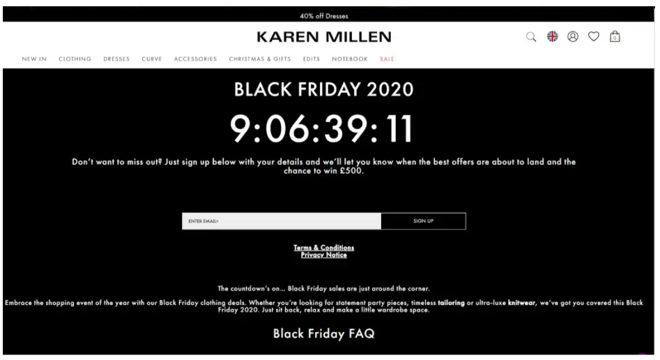
Karen Millen
Here’s another Black Friday example, only this time from the fashion industry.
A well-known retailer, Karen Millen, capitalized on the influx of peak season traffic by creating a squeeze page inviting people to sign up for Black Friday deals alerts and the possibility to win £500.
To add a sense of urgency and encourage users to sign up they have also added a live countdown timer to enforce the message of missing out. Again the design is simple with one email capture field.
Key takeaway from Karen Millen: Use interactive elements, such as countdown timers, to instill urgency.
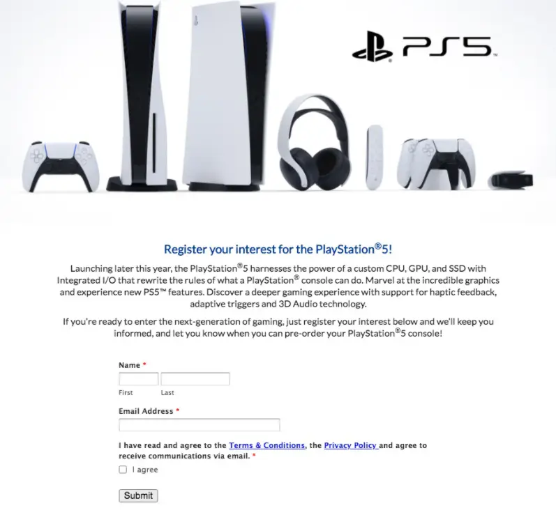
Sony PlayStation
The launch of PlayStation 5 was a highly coveted event in the gamer community. Recognizing the high demand, Sony created a way for people to “register their interest” in the new console ahead of its official launch.
Whilst the squeeze page design is rather bare bones, this is still an effective way to collect customer data with little to no friction.
Key takeaway from PlayStation: Include enticing, high-quality imagery of your products.
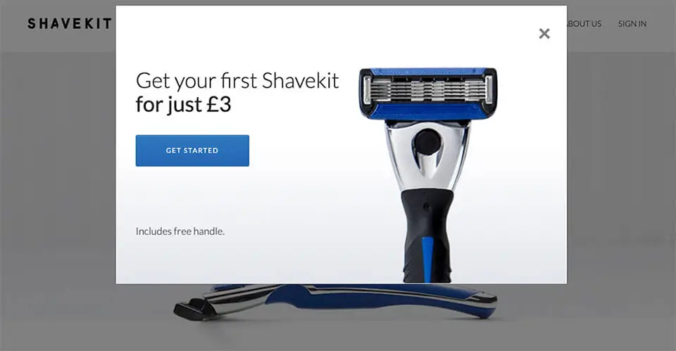
Shavekit
Shavekit utilized a couple of smart engagement tactics to get their website visitors to convert. Besides their simple and straightforward homepage, the brand also uses a browse abandonment overlay to stop people from leaving their website.
This particular overlay leads the user to a perfectly-crafted squeeze page.
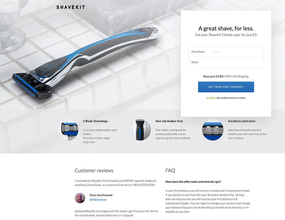
Shavekit use bright and attention-grabbing imagery and feature the sign-up form above the fold where it gets the most eyeballs.
They also break down the unique selling points of their product into easily digestible bits. Even at a glance, the visitor is receiving all the information they need to know that could tempt them into subscribing.
To persuade visitors further, Shavekit also makes sure to include social proof from real-life customer reviews, supported by their social media handles. Plus, a quick FAQ section aims to remove additional signup barriers.
Key takeaway from Shavekit: Include social proof (reviews, testimonials, trust badges, etc.) to instill trust in your visitors and make it easier for them to convert.
Subway
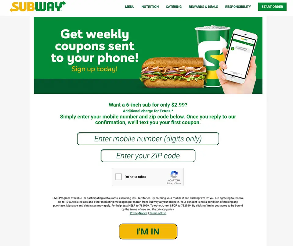
Finally, let’s take a look at a squeeze page that is geared towards SMS opt-in.
Subway wants to keep their customers engaged with their latest offers, and to do so, they’ve created a simple squeeze page to get people to sign up to SMS notifications.
Starting with a high-impact hero image that clearly explains the offer, to a further incentive (6-inch sub for $2.99) down the line, Subway makes it clear for people to opt-in.
Key takeaway from Subway: Make sure you include links to your Privacy Policy and T&Cs in case visitors want to double-check that their data is going to be handled safely.
How to design a high-impact squeeze page: Best practices
To make your squeeze page is highly converting and correctly optimized, there are some best practices to follow. Ensure your squeeze page includes:
1. An enticing value proposition. If visitors don’t feel that they will benefit from your offer, they won’t engage. Make sure your squeeze page makes the value proposition clear and enticing. Keep the details concise so that they’re quick to understand, but try and include as many persuasive or unique selling points as possible.
2. Social proof. Social proof can be included on squeeze pages to instill FOMO, or to reassure customers that the exchange is worth doing. Testimonials and reviews can be added that highlight happy customers’ feedback, as can social proof counters such as “X loyal members and counting,”, or “X people downloaded in the last 24 hours.”
3. Keep it brief. A squeeze page should only contain an encapsulating headline, three or four bullet points that highlight the benefits of your proposition, and a one or two field form designed to capture email addresses without distraction. Providing too much information and too many visuals can overload your visitors with information and be detrimental to your list building efforts.
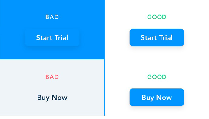
5. Obvious CTA. Squeeze pages should contain no more than one call-to-action and it should be clear but also creative. You can opt for something simple like “Subscribe” but also for something a bit more whimsical, like “Join the VIPs.”
3 tools to help you create squeeze pages faster
InstaPage: InstaPage is a dedicated landing and squeeze page builder offering over 100 already made and highly optimized page templates. Pages are easily created with a drag and drop builder and items such as buttons, headlines, images and videos, and different length forms can all be added.
ClickFunnels: ClickFunnels gives various funnel options optimized for lead capture, sales, event, and even membership funnels. However, most notably ClickFunnels includes a Squeeze Page Funnel option. This option collects visitors’ email address, then directs them to a further Thank You page when sign up is completed. The editor is drag and drop, so the pages are simple to create and can contain customizable elements like headlines, images, input forms, and video widgets.
PageWiz: PageWiz is designed to be a versatile page builder that allows for the easy creation of various marketing pages including lead capture pages and landing pages. The landing pages come with pre-installed A/B testing tools, which supply real-time stats to help you identify which pages are converting. PageWiz stands out from the crowd with its built-in lead management system. A section dedicated to leads compiles leads generated from your page, as well as sending them to your chosen email service provider.
In conclusion
Squeeze pages are useful list building tools that can help eCommerce retailers capture email addresses in a way that overlays and pop-ups cannot.
Squeeze pages are versatile, meaning they can be deployed for a number of different campaigns. Merchants could set up a squeeze page to entice visitors to sign up for loyalty programs, just as travel agents could direct their audience to download supplementary guides.
Make sure the benefit of converting is clearly and concisely displayed, then ensure that you deliver on it once a visitor has entered their email address. Provided you offer something of value and you follow our tips, your squeeze page will elevate your conversions.