BLOG
7 Steps to Creating a High-Converting Email Sign Up Form [+ Tips and Examples]
Updated: Mar 31, 2023
An email sign up form is the first thing you need to consider when implementing a list building strategy for your business. Here we share 7 secrets that will help you create high-converting email forms and exponentially grow your subscriber base.
Across industries, the average email sign up rate varies between 1.95% and 4.77%. Whilst the numbers may seem small, there’s a lot that goes into making that 3% difference.
Factors such as the number of fields or the types of fields featured on an email form can make a huge difference in its conversion capacity. For example, Omnisend research suggests that sign up forms with three fields have the highest conversion rate averaging 10%. Similarly, forms that asked for an email and name converted higher (7.41%) than those with email and birthdate (5.73%) or email and gender (5.93%) fields.
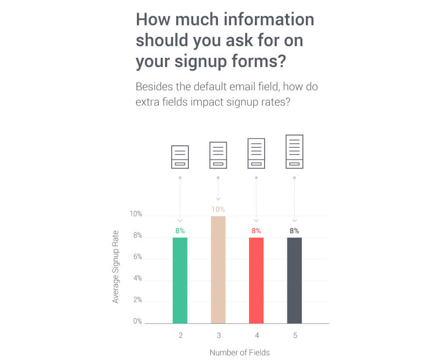
These numbers simply go to show that how you present your email sign up form, and the information you ask for, really matters. If you haven’t been able to achieve success with your forms so far, don’t worry! We’ve got plenty more information to share – just keep on reading.
A quick recap…
? What is an email sign up form? An email sign up form is used to collect first-party customer data, most notably email address, name, phone number. This data is then used to provide relevant email communication from the brand to its subscribers.
7 steps to a high-converting email sign up form template
The harsh truth is that the process of creating a sign up form can be as easy or as difficult as you’d like it to be.
On one hand, you can always use an embedded sign up form on your webpage footer. It’s not going to drive an incredible amount of new subscribers, but it’s quite an easy, nonintrusive way to get that occasional email into your database.
However, for a truly powerful email form that helps you increase conversion rate and gets your eCommerce store visitors excited about subscribing to your list, you will need to go the extra mile.
Not only does your form need to work from a technical standpoint, it needs to be visually appealing, trigger at the right time as to not irritate the user, offer an enticing value exchange, and also be trustworthy enough so that people don’t feel wary of handing over their personal information.
Below you’ll find our best practices for creating an email sign up form that converts.
1. Balance your form fields
We’ve already established that the number of form fields is an important factor in designing an effective email capture form. But how do you choose which fields to include and which ones to ditch?
The answer lies in your campaign goals.
For example, if your goal is to keep people updated with your company’s blog content, the only data that you really need is an email address.

However, as an eCommerce business, you might want to keep people updated with new product arrivals or recent promotions. In order to deliver personalized email communications, you’ll need more data than just an email address: The subscriber’s name, gender, location, category interest might all be super helpful.
Lastly, if you’re promoting a loyalty program to your returning customers and your sign up form ultimately leads to account creation, you might want to include additional fields that will help you personalize the loyalty program.
Here’s an example from Sephora. In order to sign up for its Beauty Insiders program, visitors need to input their first and last names, email address, phone number, birth date, ZIP code, and create a secure password.
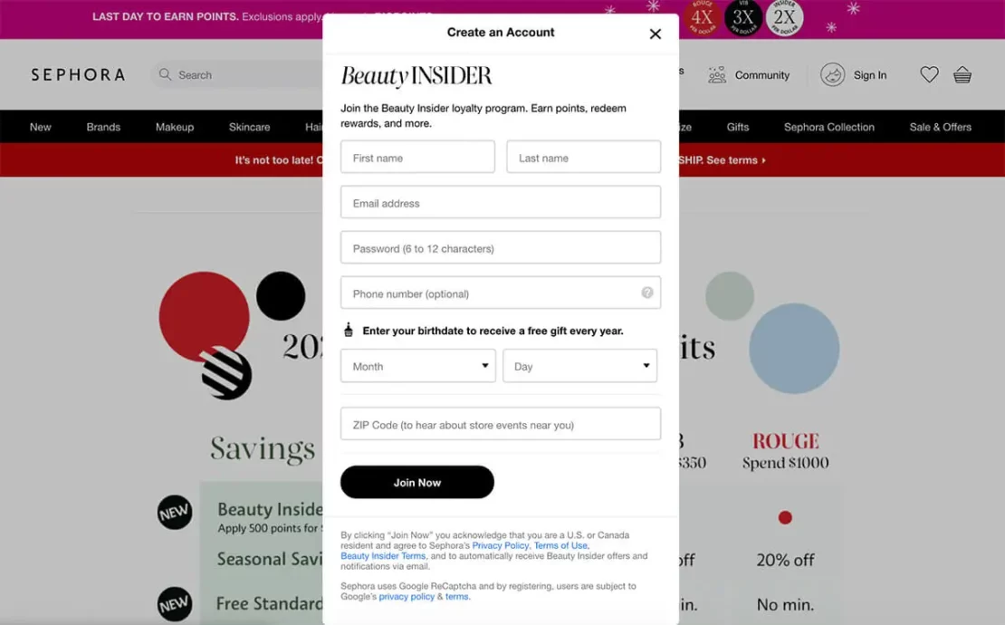
One thing to caveat here is that while single-field email sign up forms generate more leads, longer forms tend to generate higher quality contacts. A prospect who is willing to fill in five or more fields is likely to have higher purchase intent and thus convert faster.
Fewer fields = higher volume of leads.
More fields = higher quality leads.
2. Provide value exchange
The vital part of any successful acquisition campaign: The value proposition. To make your website visitors hand over their precious personal data, you need to show them why it’s valuable to them.
Thankfully, eCommerce brands can approach this in several different ways. Your value props can range anywhere from small discounts, to convenient product notifications, exclusive community benefits, interesting content, and more.
Yieldify worked with the pizza behemoth Domino’s to create high-impact list building campaigns aimed specifically at new and abandoning website visitors.
Customers who were set to abandon their shopping cart were prompted with a 25% discount overlay that featured a single-field email sign up form. This simple tactic captured over 58,000 new email leads and increased Domino’s conversions by 13%.
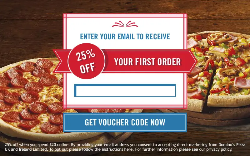
Why such a success? Domino’s campaign not only featured a significant incentive, it was also timed perfectly to match the website visitor’s behavior. A person who was hesitant to convert in-session is now happy to do so and hand over their personal data in exchange for a juicy discount.
Always remember – you don’t have to sacrifice your margins to effectively grow an email list. Our internal data suggests that email sign up forms without a discount still have a decent 3.8% opt-in rate when compared against the slightly higher 5.9% opt-in rate of those with a discount.
Form with a discount = 5.9% CR
Form without a discount = 3.8% CR
3. Choose the right CTA
A great value proposition must be followed by a strong call-to-action. One way of crafting effective CTA phrases is to write them from your reader’s point of view, highlighting the instant benefit they’ll receive from acting.
Benefit-oriented power words such as create, explore, join, save, and upgrade can replace archaic click, submit, and subscribe. Consider changing plain call-to-actions like “Subscribe now” into engaging CTAs like “Get instant access” or “Save money now!”
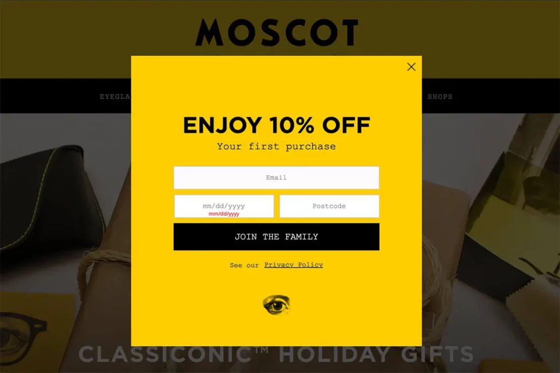
See this creative example from our client Moscot. As a five generation family-owned business, they’ve chosen to make their call-to-action a bit more personal by inviting website visitors to “Join the family.”
You can also write in first-person to make the CTA buttons even more engaging. Instead of “Sign up” you could say “Sign me up!” or “Enroll me!”
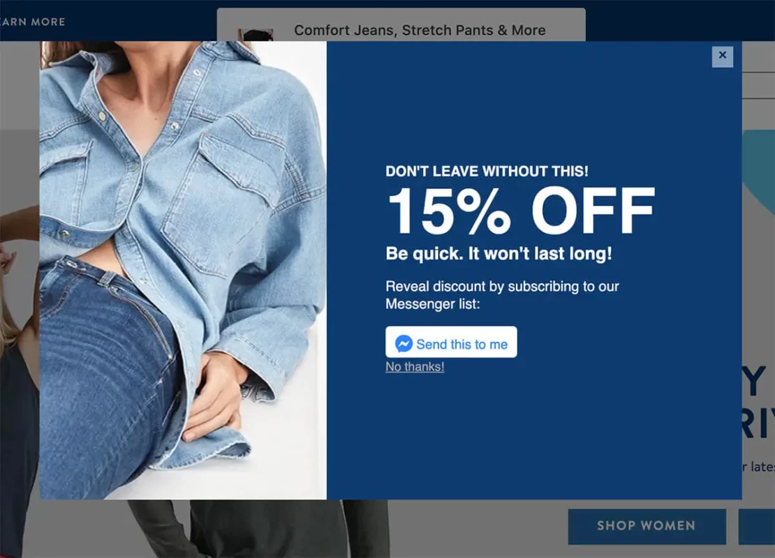
Here’s an example from Mavi Jeans. The brand uses a Facebook Messenger integration to connect with its visitors on social media. The button copy says “Send this to me” speaking directly from the visitor’s perspective.
4. Create an eye-catching design
Email sign up forms don’t have to be void of creativity and limited to the confines of a box.
Unorthodox formats, eye-catching visuals, and interactive design elements, such as images or GIFs, can help break the ice between your business and the website visitor, especially if you can insert humor or brand personality. Here’s a (inconclusive) list of ideas on how to make your form designs really stick out:
- Use interactive content, such as video or GIF in your form.
- Use gamification, such as wheel of fortune or scratchcard elements.
- Turn your form into a quiz.
- Use transparency and shadows to make your form pop off the page.
- Add social proof (eg. Join 10,000 subscribers) to instill trust.
- Include drop-down menus and/or radio buttons to learn more about your subscribers.

5. Consider the overall user experience
Whilst it’s really important that your visitor sees your form, it’s also imperative that it doesn’t distract from the rest of the user experience.
Sign up forms that forcibly deter the visitors’ attention, for example by appearing as full-screen modals covering the content underneath, are often perceived as annoyances and therefore can do more harm than good.
At Yieldify, we always advise our clients to opt for a harmonious approach that compliments the customer journey. Here’s an example of how we did this working alongside Australian chef, Teresa Cutter, for her website The Healthy Chef.
When performing the initial website analysis and creating a customer journey map, our experts realized that The Healthy Chef’s blog content was highly engaging but rarely facilitated conversions. To make use of this premium spot without interfering with the content, we deployed a floating button campaign.
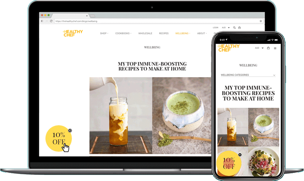
The button would appear at the bottom left corner of the screen offering a 10% off discount. Once clicked, the button would extend into an overlay. that featured an email sign up form. The subtle approach reached a 54% increase in email sign-ups!
The lesson here is to identify high engagement and conversion areas of your website and to think outside of the box with your email capture form placement.
6. Pick your timing
Just like the placement of your email form, the timing needs to be right too. The basic rule is: Don’t jump the gun. Email sign up forms that appear at inconvenient times can distract your visitors from performing higher value conversions, such as adding an item to the cart or finishing a purchase.
Here are some of the timing parameters available at Yieldify:
- Upon page load, i.e. immediately when someone lands on a page.
- Upon % of page scrolled, i.e. when someone scrolled a certain percentage of the page.
- Upon time on page, i.e. when someone spent a certain amount of time on the page.
- Upon click or hover, i.e. when someone interacts with a pre-defined element on the page.
- Upon pages visited or number of sessions, i.e. when someone interacts with your site on multiple occasions.
- Upon exit intent, i.e. when someone indicates they’re about to exit the page.
- Upon rapid scroll, i.e. when someone quickly scrolls through your site (typically on mobile). See an example below…
In order to pick the timing that works for you, you will likely have to go back to your campaign goals. If you’re running a “welcome new users” campaign, then triggering the sign up form shortly after arrival makes sense. However, if your goal is to collect emails from highly engaged visitors, you’ll want to wait until they’ve browsed around a bit.
Similarly, if you want to incentivize visitors without hurting your margins, showing a form with a discount code only to visitors who are about to exit the page is the best way to go about it.
3-5 targeting criteria is the sweet spot for a high email submission rate.
7. Comply with privacy regulations
Privacy policies and mentions of other legalities can help your forms convert. In the age of GDPR, CAN-SPAM, and CASL users from Europe, the United States, and Canada come to rely on these acronyms to reassure them that their data will be handled confidentially and correctly.
Ensuring your forms and email practices are compliant can help remove barriers associated with handing over personal information. Make sure you get consent from your subscribers and offer them transparent ways to opt-out from marketing communications.
Get inspired! 4 email sign up form examples from eCommerce brands
Madewell: Great call-to-action
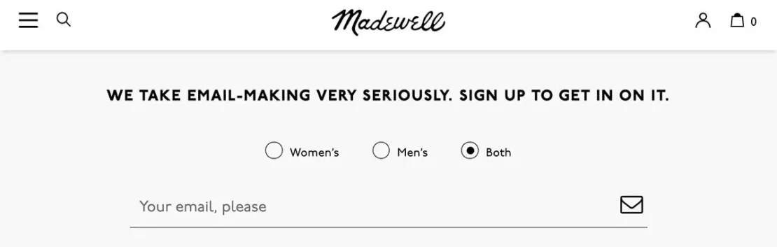
Fashion eCommerce brand Madewell has many different list building tactics deployed on its website, but we’d like to pay attention to the humble embedded email sign up form located in the brand website’s footer.
The form is super clean with only one field. However, it brings extra personalization into the mix by asking subscribers to choose which product groups they’re mostly interested in: women’s, men’s, or both? But the main reason we chose this example is the headline, which acts as a call-to-action.
Madewell instills trust by stating they take “email-making very seriously” and go even further by linking to an email preference page, which allows subscribers to manage the communications they receive from the brand.
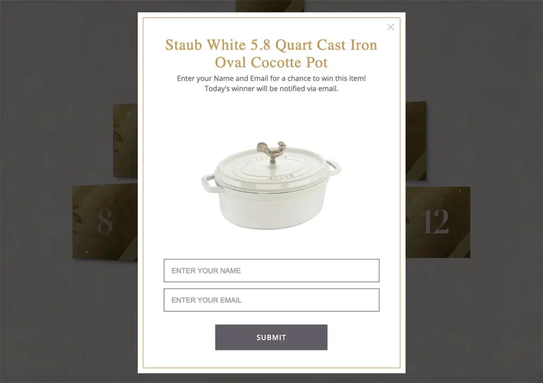
Kathy Kuo Home: Amazing incentive

As part of its holiday eCommerce marketing strategy, our client Kathy Kuo Home created an exciting 12-day giveaway. Complete with a custom landing page, the giveaway is also teased on the brand’s homepage using a subtle sticky notification.
This is an incredible strategy to supercharge your email list: It is topical, beautifully designed, and offers a set of amazing incentives in return. From a business perspective, this is also an effective way to keep your brand top of mind and introduce new subscribers to your product range.
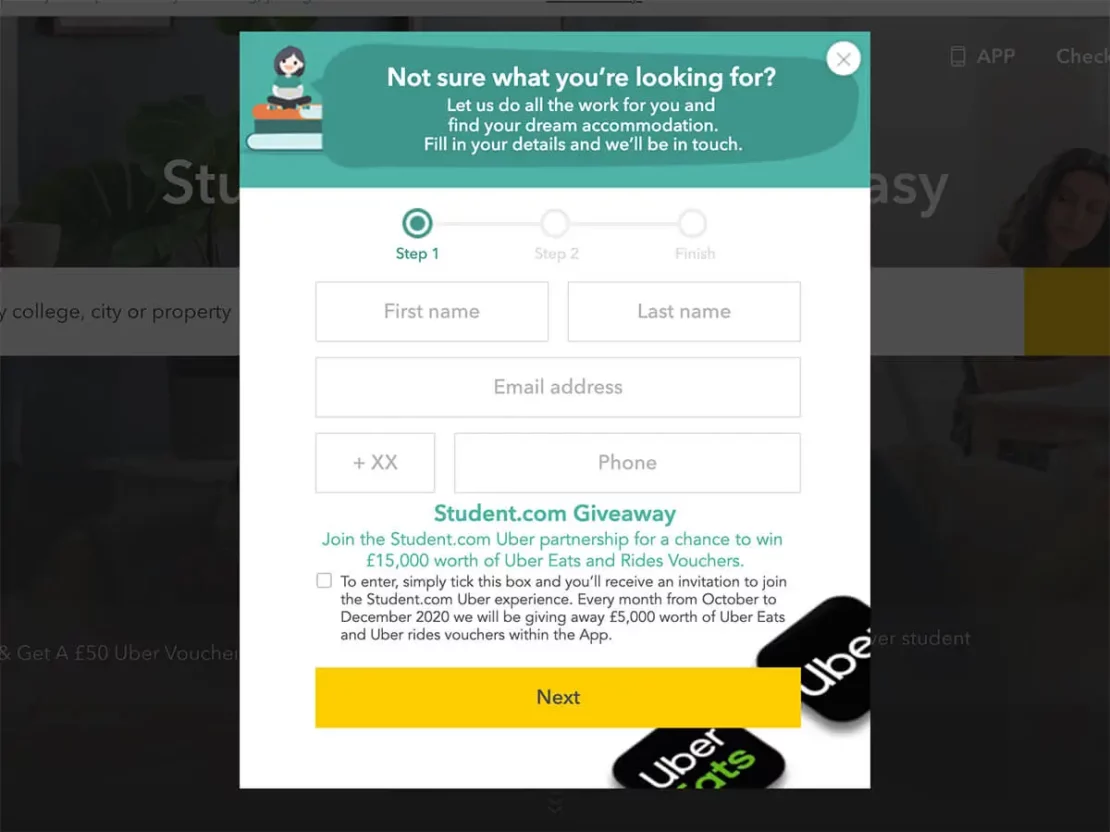
Student.com: Perfect timing
Student housing provider Student.com makes great use of exit-intent technology to recover browse abandoners with a perfectly-timed email capture form.
The form has a strong call-to-action offering to alleviate the visitor’s pains by solving their accommodation needs: All they need to do is subscribe! The form also transparently showcases the subscription process by using a progress bar.
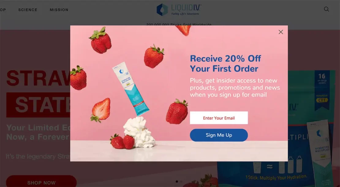
Liquid IV: Memorable design
Yieldify client, electrolyte drink mix manufacturer Liquid IV, does a great job at communicating the drop of their limited edition strawberry flavor by featuring it on the hero image and the email capture form as well.
Although simple in its format, the sign up form is beautifully designed with a high-quality background image showcasing the product and a contrasting call-to-action button that follows the brand design guidelines.
How to build an email sign up form?
Now that we’ve covered the best practices and looked at some examples from innovative eCommerce brands, let’s see what are the easiest way to go about building an email sign up form. Generally, you can choose from the following options:
- Form builders, such as Paperform or Typeform.
- Email service providers, such as Klaviyo or MailChimp.
- Fully-managed personalization solutions, such as Yieldify.
Form builders are great for businesses that are on a budget and want to test the waters before committing to a more fully-fledged list building tool. Similarly, lots of email service providers (ESPs) and customer relationship management software have native email sign up form builders.
Alternatively, if your business needs a more encompassing lead capture software solution that includes cutting-edge email personalization strategies, advanced integrations, data-rich analysis and reporting, a fully-managed service like Yieldify is a good way to go. Get in touch with our team to learn more!
In summary: Why nailing your email sign up forms is so important
Email lists are essential tools for any business. It’s the best way to reach your customer base, introduce them to your brand, sell products and foster long-term relationships. But to begin that process, you must get your email sign up form right.
At Yieldify, we’re witnessing the benefits of high-converting email forms first-hand. With the help of our lead capture software, our clients see an average of 10-25% database growth, with some reaching as much as 116% increase in the leads captured. Not to mention the increased AOV and CLV that email marketing brings over time.
We hope this article was useful and enables you to create super high-converting email sign up forms. If you want to test your email capture strategy further, take our quiz and get more tips on how to improve!