6 Must-Know Web Design Trends That Boost Conversions
| By Lana Kropyvna | 0 Comments
We’ve compiled 6 key web design trends to help you create a seamless user experience on your eCommerce store and boost conversions in the process.
Do you remember how Argos operated a few years ago?
No products on display and everything kept in a behind-the-counter warehouse meant you’d spend an eternity flicking through huge catalogues in an attempt to find the perfect product.
Once found, you’d punch the product number into a little machine checking stock levels before filling out an in-store order form.

It was a long winded, infuriating experience.
Well, Argos got wise to the poor user experience and started rolling out digital stores. Stores where shoppers could to quickly find and order their perfect products from an in store iPad.
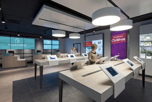
There’s no difference in the information provided in either store, the difference is simply in improving the user experience. Users in the modern stores are presented with a more streamlined, user-friendly experience which has helped Argos increase overall sales.
It’s exactly the same with your online store. Improving user experience is proven to increase engagement, conversions, and customer satisfaction.
But it’s not just about following the latest web design trends, it’s about applying them in a way that streamlines the path to purchase and makes the experience of shopping with your brand so easy that users will want to shop with you again.
Let’s take a look at UX design trends that create a more fluid customer journey and boost conversions.
6 web design trends known to boost conversions
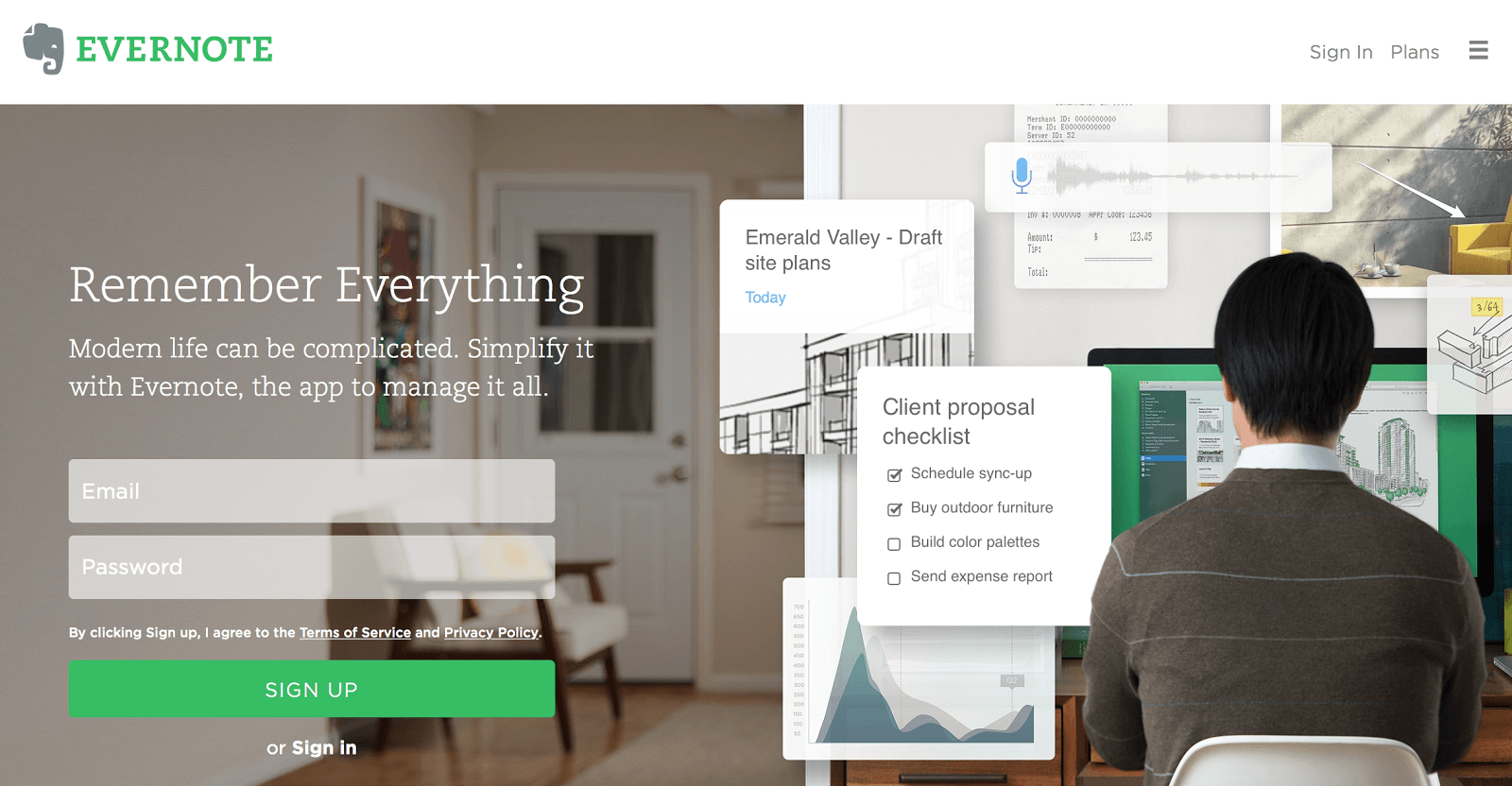
Split screen
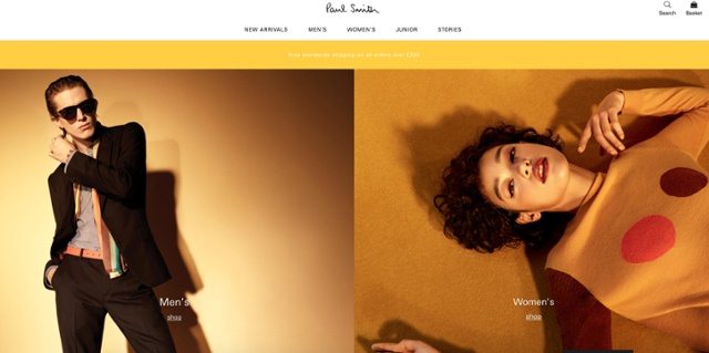
The faster you segment your audience the easier it will be to display products they’re interested in purchasing.
In the above example from Paul Smith’s home page, users can immediately reduce the product selection by 50% to only include clothing of the gender they are shopping for. That’s 50% of products immediately removed from your browser based on an initial click.
Split-screen is one UX trend that enables users to quickly and easily identify the option that’s best for them and helps you provide a more targeted and user-friendly experience.
Optimize navigation
Navigation has long been the bane of online stores.
As internet shopping has become more popular brands have started to add more products to their range. This inevitably leads to a bloated product range and navigation.
We all know, thanks to studies like the Jam Study, that an increasingly large product range confuses users. It makes it harder for them to find the perfect product for their needs and increases the likelihood of post-purchase regret.
Navigation needs to remain as simple as possible and prioritize the most useful pages for users. However, in navigation design, there’s one common web design trend faux pas that complicates matters: Burger menus and non-prioritized navigation.
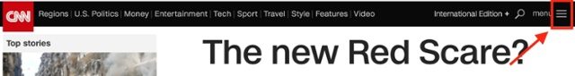
Burger menus, so named for their three-tier appearance, are often used to hide menus behind a clickable icon.
They’re great for effectively utilizing space, but don’t help users find what they need or direct them where you want them to go.
Hamburger menus complicate the customer journey. They add an extra link into a journey that you should be trying to simplify.
If a user wants to see a specific page they have to click on the hamburger icon, find the relevant page link in the dropdown then click on the relevant link. They make a huge assumption that the user knows how you’ve organized your navigation and where to find what they need.
You should use burger menus to hide secondary navigation goals so you can display primary pages and the areas you want users to see in your initial menu.
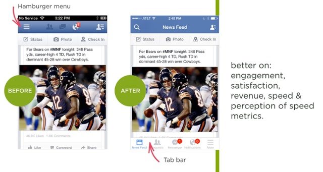
Prioritize your menu so it displays the pages you want users to view and hide the less important pages that don’t contribute to conversions behind the burger.
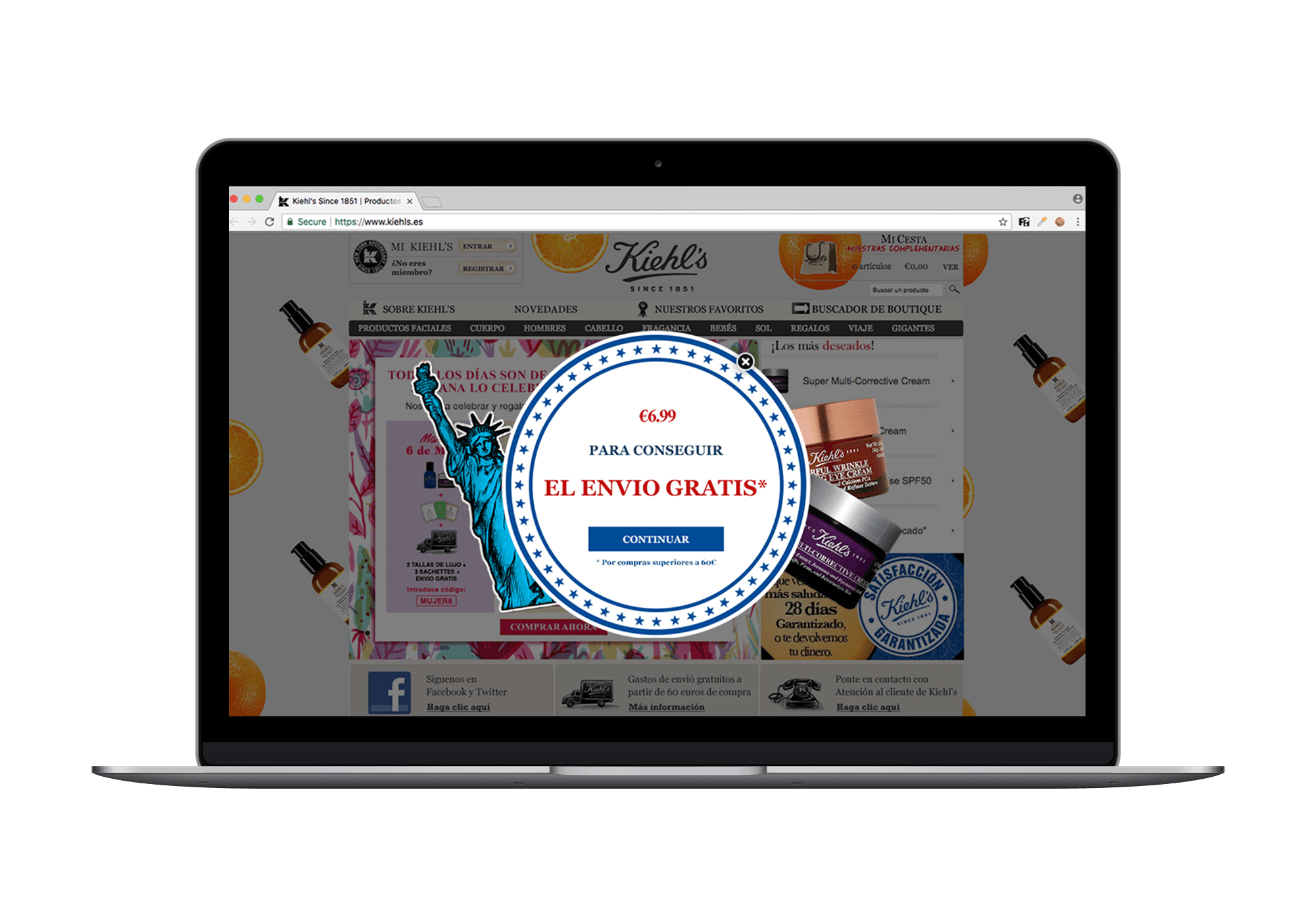
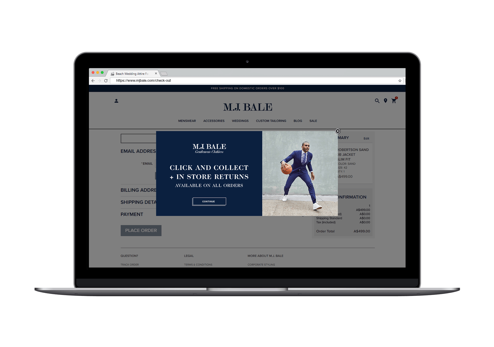
Eliminate distractions
One page, one purpose. The golden rule of CRO.
Distractions are the enemy of conversion. Leave something on-page that might distract users from the action you want them to take, and it’s a safe bet it will do exactly that.
You’ve got to create a path to purchase of least resistance. One that ushers users down the funnel you want them to take. Erroneous links, images, and buttons aren’t going to help, they’re going to stop users from taking that key action you need them to.
When you’re optimizing anything from landing pages to blog posts and emails you should have one goal in mind. A single conversion goal everything on page contributes to.
To help keep your content as simple, effective and on message as possible, be sure to exercise the below.
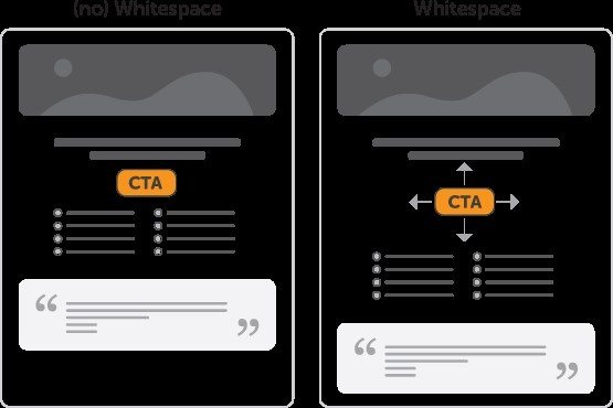
- Use a large, single column CTA with effective white space so users literally cannot miss it.
- Remove useless sidebars. impactbnd.com removed their sidebars and saw a 71% increase in conversions.
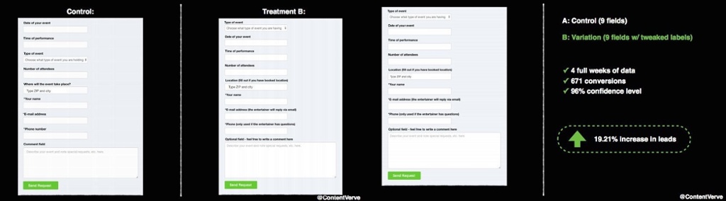
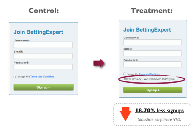
- Only include relevant fields on lead capture forms. It’s not just about reducing form fields, but also about the relevancy of the leads you capture and overall usefulness of your database.
- Use full width images as they’re proven to capture attention and keep your user on the page you want them on.
Aesthetics are important
We’re not referring to the overused advice of “use orange CTAs because Amazon does.” That’s not going to help.
What will help is an understanding of how colors interact with one another and what combinations will help key elements of your page, like CTAs, important details, and text links, stand out from the page.
In fact, 92.6% of people take the visual factor into consideration when choosing whether or not to purchase. Typography is also another important element that, with a little experimentation, has helped achieve an increase of up to 30% on key metrics like bounce rate.
The way you present the information on your website will help establish your brand image. If you can align that image with the expectations of your users then you’re already winning the battle to boost conversions.
Video
Online content is not just written. Content can be made to stand out with the smart use of images and colors, but the next (or more accurately, current) big thing is video.
Due to current web design trends, Cisco predicts that as early as next year, video content will account for 69% of all consumer internet traffic, and video on demand will have almost trebled. Video is a peerless medium when it comes to reach. Youtube alone receives over a billion users every month.
Consumer habits are already favoring video content because it’s a great medium for communicating large amounts of information in a short amount of time. It’s more engaging than other content types, can give your brand a face, and is better at displaying the tone of your business.
It can be a daunting task to define the public image of your brand through video, but if done well it helps to build trust and boost conversion.
Keep it simple
When it comes to web design and UX trends there’s one simple, overriding rule: Keep it simple.
Good user experience is not about providing everything on one page. It’s about simplifying the customer journey and not bombarding users with too much information.
The tips in this article will help you improve your UX, but if you ever find yourself confused and not knowing what to do, follow the example set by the jam study and simplify everything you’re offering.


![Data insights: a visualization (Gregor Aisch) [3]](https://www.yieldify.com/wp-content/uploads/2017/09/FINDING-INSIGHT-DATAasset.png?t=1506719038616 "Data insights: a visualization (Gregor Aisch) [3]")

Recent Comments